In Design Studio 1.6, we are adding a few functionalities to the Geo Map component. In this post I will give an overview of what's new with Geo Maps.
Pie charts
Pie charts are a new layer type for the Geo Map component. A pie chart layer contains the following properties:
- Latitude / Longitude: to be set if the pie charts are meant to be displayed at specific latitude / longitude.
- Measure: the measure to be used for the pie chart. Only one measure can be displayed in a pie chart.
- Custom GeoJSON file: to be set if the pie charts are meant to be displayed at the center of a GeoJSON shape
- GeoJSON Mapping property / type: similar to the Shape Layer
To display a pie chart layer, the data source needs to be configured in the following way:
- Measures should be in the columns
- The first dimension in the rows should be the geo dimension (similar to a shape layer)
- The second dimension in the rows will be used to display the slices of a pie chart

Example of an initial view that could be used to display a pie chart layer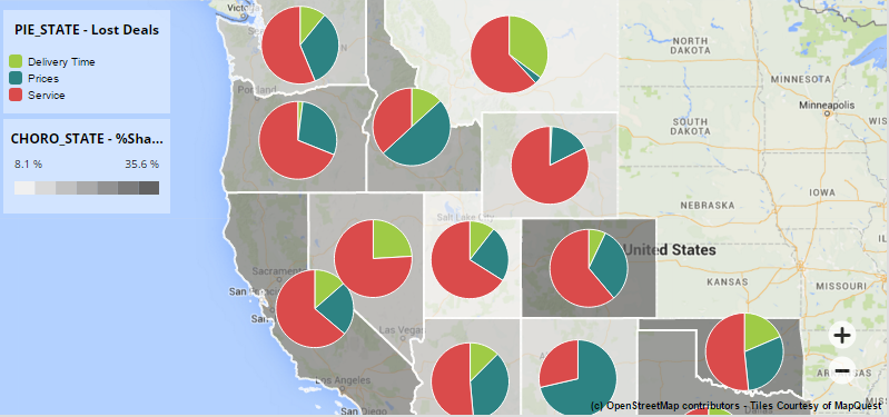
A Geo Map component displaying a shape and a pie chart layer
:!: Changing the colors of the pie slices: The only way to change colors for the pie chart layer is through CSS. A color picker will be added in the next version of Design Studio, but in the meantime a workaround is to use CSS to override the default colors. The example below will overwrite the first 3 colors of the color palette.
path[fill="#748CB2"] {
fill: #9FCB46;
}
path[fill="#9CC677"] {
fill: #2D8383;
}
path[fill="#EACF5E"] {
fill: #DA4B4B;
}
The default color palette used is the same as the Info Chart component. The first 6 values are: #748CB2, #9CC677, #EACF5E, #F9AD79, #D16A7C, #8873A2
Lines and multi-lines
If a GeoJSON file contains lines and multi-lines, they will now be rendered in a shape layer. Their color will vary depending on the measure associated.

Example of lines displayed on a Geo Map
Custom markers
It is now possible to override the default marker for a point layer. To do so, you must upload a raster image (typically GIF, JPEG or PNG) using the "Custom Marker File" property of the point layer.
Use the "Vertical Anchor" property to define where the center of the marker is. For instance in the example below, the vertical anchor is set to "Bottom Center".
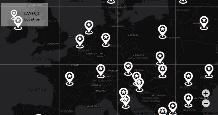
Example of custom markers on a Geo Map
Classification types
For a shape layer, it is now possible to choose between 2 classification types. This defines the distribution of values in the different categories of a shape layer.
- Equal interval: each category is equal in size. The entire range of values is divided equally into 7 categories.
- Quantile: each category contains the same number of values, which means that their size will differ depending on the data set

GDP of world countries: quantile classification on the left, equal interval on the right
