
- SAP Community
- Products and Technology
- Technology
- Technology Blogs by SAP
- More details of DatePicker
Technology Blogs by SAP
Learn how to extend and personalize SAP applications. Follow the SAP technology blog for insights into SAP BTP, ABAP, SAP Analytics Cloud, SAP HANA, and more.
Turn on suggestions
Auto-suggest helps you quickly narrow down your search results by suggesting possible matches as you type.
Showing results for
 JerryWang
Advisor
Options
- Subscribe to RSS Feed
- Mark as New
- Mark as Read
- Bookmark
- Subscribe
- Printer Friendly Page
- Report Inappropriate Content
10-09-2015
9:04 AM
- What does DatePicker look like
- How to define DatePicker in xml view
- Implementation of DatePicker.js
- Implementation of Calendar.js
- When and where are these divs generated?
- event design in Calendar.js
- Event delegation in the runtime
Recently in order to resolve customer incidents, I need to study more details about DatePicker control. I share what I have learned in this blog.
What does DatePicker look like

There is a small window icon, by clicking it, you can choose any date from popped up calendar.

How to define DatePicker in xml view
<caui:DatePicker id="td"

          value="{path: 'vm>/ToDate', type:'sap.ui.model.type.Date', formatOptions: { style: 'long'}}"

          change="onToDateChanged"></caui:DatePicker>
- namespace for caui: xmlns:caui="sap.ca.ui"
- onToDateChanged is event handler defined in application ( consumer ). The event name is: "change".
Implementation of DatePicker.js
You can find source code via the path: sap/ca/ui/DatePicker.js.

By reading the source code, here are some keynotes:
1. The DatePicker is a composite control, which holds a calendar control internally. This could be known by line 38 ( reference this._oCalendar points to the internal calendar control ).
2. The DatePicker has sap.m.InputBase as its prototype ( line 34 ).
3. The DatePicker has two properties defined in metadata. To be exactly, there are three. The third is "Value" which comes from the prototype "sap.m.InputBase".
properties: {

            "firstDayOffset": {

                type: "int",

                group: "Data",

                defaultValue: 0

            },

            "dateValue": {

                type: "string",

                group: "Misc",

                defaultValue: null

            }

}
4. Whenever there is selection change in DatePicker, it will call fireChange and finally event "change" is issued. This is reason why you have to bind your event listener to "change" event in xml view. You can also find that two values ( newValue, newYyyymmdd) are passed to event listener as parameters. We will debug it later.
sap.ca.ui.DatePicker.prototype.fireChange = function(u) {

    if (!this._dateType) {

        this._setUpDateType();

    }

    var c = this.getValue();

    var t = this._validateDate(c);

    if (u || u === undefined) {

        this.dateObj = t;

    }

    this.setDateValue(t);

    var d = null ;

    if (t) {

        d = this._toDateStringYYYYMMDD(t);

    }

    this.fireEvent("change", {

        newValue: c,

        newYyyymmdd: d,

        invalidValue: t ? false : true

    });

    return this;

}
Implementation of Calendar.js
Do Element inspection via Chrome development tool, for example inspect the UI area for Oct-16, you can find the area actually consists of a span node with value 16 and another hidden input with content "Fri Oct 16 2015".

Scroll down and you can find more divs which represent the corresponding date in UI.

When and where are these divs generated?
1. In the init function of DatePicker, it fetches the prefix for each day which is used to render the content of hidden input element as introduced before.

The same logic for month abbreviation name:

2. When you click the small icon of DatePicker, the calendar is to be rendered. Thus the render function of CalendarRender.js is called. Here below is the logic to populate span node and hidden input node.

event design in Calendar.js
Source code of Calendar.js could be found here. There is event tapOnDate defined in its metadata, with one parameter "date".

Event delegation in the runtime
1. When a given date is selected by end user, a jQuery event is issued:
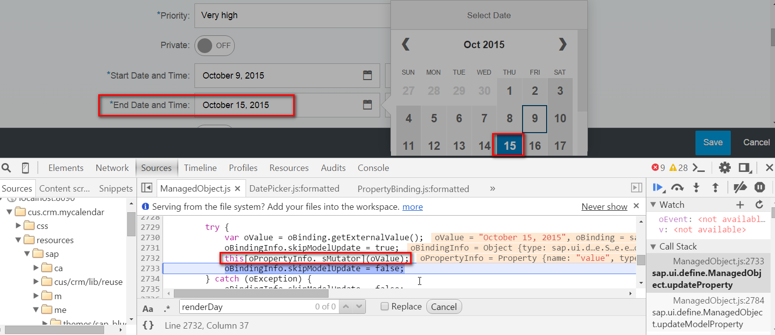
The below screenshot indicates that I have selected "Oct-15".

The private function _gestureSelect of Calendar.js is called:
Inside this function, the selected date is returned:

And then raise the UI5 event "TapOnDate" with selected date:

2. The event handler defined during the creation of internal Calendar control is called now. The passed in raw date "Thu Oct 15 2015" is formatted to "Oct 15 2015", and then assigned to property "DateValue".

Do you still remember another property "Value"? It will be filld by line 48: this.setProperty("value", t):
Its value comes from the format result of date object:

after line 20 is executed, the formatted date is "October 15, 2015":


So which exactly line of code triggers the change of the DatePicker control display, from previous date to the selected date?
For example, I have selected Oct-15 in UI, and after line 2732 below is executed, the field of DatePicker in UI will refresh correspondingly to October 15, 2015.
Internally, it is because setValue of DatePicker is called:

The call is further delegated to prototype sap.m.InputBase:

Here the Dom value is changed, so UI is refreshed accordingly.


Then DatePicker.js again raises its change event to application ( consumer ) with the two parameters:

3. Then the event handler defined in application xml view is called:

When does the formatOptions set in XML view take effect?
In xml view, we have defined style long for DatePicker's formatOptions.

In the runtime, this binding information is represented by an instance of PropertyBinding. The path, type and formatOptions configured in xml view become corresponding attributes of the instance as displayed below.
The date object "Thu Oct 15 2015 00:00:00 GMT+0800 (China Standard)" is converted to String "October 15, 2015" by line 20, which is the final content you see in UI.


- SAP Managed Tags:
- SAP Fiori
You must be a registered user to add a comment. If you've already registered, sign in. Otherwise, register and sign in.
Labels in this area
-
ABAP CDS Views - CDC (Change Data Capture)
2 -
AI
1 -
Analyze Workload Data
1 -
BTP
1 -
Business and IT Integration
2 -
Business application stu
1 -
Business Technology Platform
1 -
Business Trends
1,661 -
Business Trends
85 -
CAP
1 -
cf
1 -
Cloud Foundry
1 -
Confluent
1 -
Customer COE Basics and Fundamentals
1 -
Customer COE Latest and Greatest
3 -
Customer Data Browser app
1 -
Data Analysis Tool
1 -
data migration
1 -
data transfer
1 -
Datasphere
2 -
Event Information
1,400 -
Event Information
64 -
Expert
1 -
Expert Insights
178 -
Expert Insights
269 -
General
1 -
Google cloud
1 -
Google Next'24
1 -
Kafka
1 -
Life at SAP
784 -
Life at SAP
10 -
Migrate your Data App
1 -
MTA
1 -
Network Performance Analysis
1 -
NodeJS
1 -
PDF
1 -
POC
1 -
Product Updates
4,578 -
Product Updates
318 -
Replication Flow
1 -
RisewithSAP
1 -
SAP BTP
1 -
SAP BTP Cloud Foundry
1 -
SAP Cloud ALM
1 -
SAP Cloud Application Programming Model
1 -
SAP Datasphere
2 -
SAP S4HANA Cloud
1 -
SAP S4HANA Migration Cockpit
1 -
Technology Updates
6,886 -
Technology Updates
389 -
Workload Fluctuations
1
Related Content
- SAP Enable Now setup in Technology Blogs by Members
- It has never been easier to print from SAP with Microsoft Universal Print in Technology Blogs by Members
- Migration and Upgrade from SAP SCM 7.0 EHP3 on Windows 2008 to SAP SCM 7.0 EHP4 on Windows 2019 in Technology Q&A
- Comprehensive Guideline to SAP VMS in Technology Blogs by Members
- Consuming SAP with SAP Build Apps - Connectivity options for low-code development - part 2 in Technology Blogs by SAP
Top kudoed authors
| User | Count |
|---|---|
| 11 | |
| 11 | |
| 11 | |
| 9 | |
| 9 | |
| 9 | |
| 9 | |
| 8 | |
| 7 | |
| 7 |