- SAP Community
- Products and Technology
- Technology
- Technology Blogs by SAP
- Nuclear power stations analysis in SAP Lumira
- Subscribe to RSS Feed
- Mark as New
- Mark as Read
- Bookmark
- Subscribe
- Printer Friendly Page
- Report Inappropriate Content
Hello everyone!
I am a newbie to all that things about analytics, especially predictive, but SAP Lumira made my introduction in this topic very smooth. Great to have such simple and powerful instrument in one application!
As a former employee of Russian State Corporation «Rosatom» which builds, owns and operates all nuclear power stations in Russia and abroad, I was interested in getting and visualizing some statistic data about power stations in USA.
All the data was downloaded from http://data.gov
I decided to make some charts, interactive dashboards and a short glossary to explain what are PWR and BWR reactors.

First is the map, generated in Lumira, where nuclear power stations shown. The bigger circle represents bigger capacity in MWatts.

Then I wanted to know what types of reactors prevail in USA, so I grouped all of modifications of PWR and BWR and here is the answer. PWR – rulez!

And another slide is about how PWR reactors beat BWR in a timeline according to construction permissions issued.

Next 2 shows when the «jump to nuclear power» happened based on commercial operation and years of mass retire of operating stations. Hope in 2030’s we’ll find new ecological clean sources of energy.


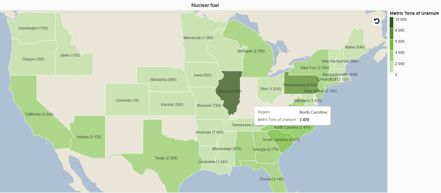
The last two are maps showing the states with the biggest amount of LLW (Low Level Waste) and nuclear fuel. Hmm, now I know where it’s better to buy a house and, guess, you too)))


Here is the video showing dashboard, based on acquired data.
- SAP Managed Tags:
- SAP Lumira
You must be a registered user to add a comment. If you've already registered, sign in. Otherwise, register and sign in.
-
ABAP CDS Views - CDC (Change Data Capture)
2 -
AI
1 -
Analyze Workload Data
1 -
BTP
1 -
Business and IT Integration
2 -
Business application stu
1 -
Business Technology Platform
1 -
Business Trends
1,661 -
Business Trends
87 -
CAP
1 -
cf
1 -
Cloud Foundry
1 -
Confluent
1 -
Customer COE Basics and Fundamentals
1 -
Customer COE Latest and Greatest
3 -
Customer Data Browser app
1 -
Data Analysis Tool
1 -
data migration
1 -
data transfer
1 -
Datasphere
2 -
Event Information
1,400 -
Event Information
64 -
Expert
1 -
Expert Insights
178 -
Expert Insights
273 -
General
1 -
Google cloud
1 -
Google Next'24
1 -
Kafka
1 -
Life at SAP
784 -
Life at SAP
11 -
Migrate your Data App
1 -
MTA
1 -
Network Performance Analysis
1 -
NodeJS
1 -
PDF
1 -
POC
1 -
Product Updates
4,577 -
Product Updates
325 -
Replication Flow
1 -
RisewithSAP
1 -
SAP BTP
1 -
SAP BTP Cloud Foundry
1 -
SAP Cloud ALM
1 -
SAP Cloud Application Programming Model
1 -
SAP Datasphere
2 -
SAP S4HANA Cloud
1 -
SAP S4HANA Migration Cockpit
1 -
Technology Updates
6,886 -
Technology Updates
403 -
Workload Fluctuations
1
- SAP Business AI : Infuse AI in applications using SAP BTP (with some Use Cases) in Technology Blogs by SAP
- Towards Sustainable Energy in Technology Blogs by SAP
- Integration of ChatPDF with S4HANA - New era of OCR with Generative AI in Technology Blogs by Members
- AI-driven Public Urban Transport Optimization: Introduction & Architecture in Technology Blogs by SAP
- Optimal Electric Vehicle Charging Station Placement - An Intelligent Data Application Demo in Technology Blogs by SAP
| User | Count |
|---|---|
| 12 | |
| 10 | |
| 9 | |
| 7 | |
| 7 | |
| 7 | |
| 6 | |
| 6 | |
| 5 | |
| 4 |