Hello Everyone. I am writing this blog as part of the DataGenius IV: How to Join challenge under the category House of Spirits - caring for the social good.
Having previously used other data analytic and BI tools BY FAR this is the easiest one I have seen and used! It's so simple to use and design various visualizations!! This is my first time using SAP Lumira so I used a sample data set available to me from the challenge. I didn't want to take one from the web that I wasn't 100% positive worked. I used the example .csv : Co2 emissions by country.
I used a number of visualisations available to see if I could get clear & useful information.
Tag Cloud:
Co2 emission changes worldwide between 2009 – 2010. Biggest words representing the largest emissions. Change the parameters to 2009 sum and you can watch the countries change.

If you scroll over the country names it will show you the 2010 emissions and the % change from 2009. Once you click on the country you are then permitted to filter by this selection or remove it completely from your visualisation. It also allows you to change the colour of the country names.
Here we see UAE, KUWAIT, QATAR and TRINIDAD & TOBAGO being the biggest. Which is accurate as we know them as being oiling countries.
If desired it permits you to merge two datasets and compare them against each other. This is a handy feature for analytics.
Pie with depth chart:
Adds the 2009 sum + 2010 sum to create the depth and uses the country as dimension.

Waterfall Chart:
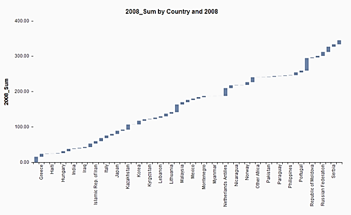
As you can see this allows you to see the country in alphabetical order and their emissions in proportion to the sum of emissions for that year. The size of the rectangle each country has represents their proportion of global emissions for 2008. Useful tool as it allows you to see the proportions differently to the pie chart. Another way of showing the emissions as a representation of the year total.
Geo Choropleth Chart:

This chart shows us a map of the world and the countries that are in our dataset. The darker countries represent the higher emissions. Again Lumira allows you to scroll over a country of your choice to see their statistics. You can then select multiple countries and see only their colours against each other. Again Qatar, Australia and the USA seem to have the highest emissions.
This only shows the tip of Lumira's capabilities as I am no expert in BI and look what I could do in a short time!!! Accept the challenge and try for yourself!!!
DataGenius IV: How to Join
P.s. Lumira is available for both download and cloud so you can take it everywhere you go!!
Thanks for reading :smile:
Lorna
