Skip to Content
Author's profile photo Former Member

Representing Business data with SAPUI5 VIZ chart – some useful Tips and Tricks

The sap.viz charting library provides a set of flexible chart controls that allow to easily

representing business data in a feature rich, graphical manner.

Quick Coding to get a BAR Chart

(Probably most of you know how to build a basic chart. Do not worry this is just starting.

Something more is waiting for you. 🙂 )

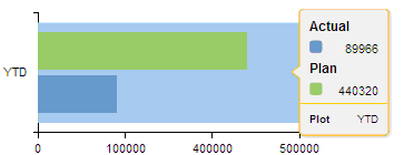
var oModel = new sap.ui.model.xml.XMLModel(); 


oModel.loadData(“/XMII/Illuminator?QueryTemplate=……

var oDataset = new sap.viz.ui5.data.FlattenedDataset();

var DimensionList = new    sap.viz.ui5.data.DimensionDefinition(); (Y Axis)

DimensionList.setAxis(1);

DimensionList.setName(“Plot”);

DimensionList.bindProperty(“value”,”YTDLabel”);

oDataset.addDimension(DimensionList);

var MeasureListActual = new sap.viz.ui5.data.MeasureDefinition();(X Axis)

MeasureListActual.setName(“Actual”);

MeasureListActual.bindProperty(“value”,”YTD”);

oDataset.addMeasure(MeasureListActual);

var MeasureListPlan = new sap.viz.ui5.data.MeasureDefinition();(X Axis)

MeasureListPlan.setName(“Plan”);

MeasureListPlan.bindProperty(“value”,”YTDPlanned”);

oDataset.addMeasure(MeasureListPlan);

oDataset.bindData(“/Rowset/Row/”);

var oChartCompare = new sap.viz.ui5.Bar

({

                           id : “ChartCompare”,

                           width :”310px”,

                           height : “100px”,

                          dataset : oDataset

});

  oChartCompare.setModel(oModel);

XML structure

<Rowset>

<Columns>…</Columns>

<Row>

<YTDLabel>YTD</YTDLabel>

<YTD>89966</YTD>

<YTDPlanned>440320</YTDPlanned>

</Row>

</Rowset>


We get Simple meaning less Bar Chart from above code 😕

/wp-content/uploads/2014/07/2_509605.png

  • I will add X axis.

/wp-content/uploads/2014/07/3_510555.png

var XAxis = oChartCompare.getXAxis();

XAxis.setVisible(true);


  • Also Y Axis

var YAxis = oChartCompare.getYAxis();

YAxis.setVisible(true);

/wp-content/uploads/2014/07/4_510554.png

  • “We don’t understand the meaning of green & blue color without legend” 😡

/wp-content/uploads/2014/07/5_510544.png


var ProdLegendYTD = 

                         oChartCompare.getLegend();

ProdLegendYTD.setVisible(true);


  • Can you give me a tooltip please ?


var ProdTooltipYTD =

                   oChartCompare.getToolTip();

ProdTooltipYTD.setVisible(true);

/wp-content/uploads/2014/07/6_510542.png

  1. But  /wp-content/uploads/2014/07/index_510734.png(My mind wants more) “3D round corner bar”

/wp-content/uploads/2014/07/15_510567.png

…………

height : “100px”,

plotArea:{                                                                   

drawingEffect:  

sap.viz.ui5.types.Bar_drawingEffect.glossy,

isRoundCorner:true,                                  

colorPalette:[color1,color2]

},

dataset : oDataset

…………

  • My charts are not C/wp-content/uploads/2014/07/12_510501.pngL/wp-content/uploads/2014/07/12_510501.pngRFUL

var color1 = “#EAC117”;

var color2 = “#38ACEC”;

var color3 = “#838B83”;

var color4 = “#728C00”;

…………

height : “100px”,

plotArea:{                                                                                        

              drawingEffect: sap.viz.ui5.types.

Bar_drawingEffect.glossy,           isRoundCorner:true,                                            

colorPalette:[color1,color2]

               },

dataset : oDataset

…………

/wp-content/uploads/2014/07/14_510530.png

  • Please show me value on the top of bar, please….

/wp-content/uploads/2014/07/10_510572.png


plotArea:{

             …………………………..

},

dataLabel:

                {

                   visible:true,

                   positionPreference : true,

                   position : sap.viz.ui5.types. 

                   Datalabel_position.outside,

                 },

dataset : oDataset

  …………………………..


  • Last one -comma separated value for better visibility

…………………………..

dataLabel:

                {

………………………

                     position : sap.viz.ui5.types.

                     Datalabel_position.outside,

                     formatString : [[“##,0”],[“en-US”]]

                 },

dataset : oDataset

  …………………………..

/wp-content/uploads/2014/07/11_510573.png

All these very beautiful and useful features of Viz chart are the overnight reinvention/research by My KOLKATA SAP MII Team. Thanks to all of them, especially thanks to Ushinar Basu, Arnab Singha, Sushabhan Banerjee, Pratibha Singh & Sucharit Dutta.


Thanks Som Sarkar and Animesh Mondal for their guidance, where we get stuck.


Thanks Sudipta Mukherjee for his great ideas & guidance on charts to impress our client at first sight.


Thanks Dipankar Saha for always inspiring me to write this kind of blog. Hope this will help everyone.

Assigned Tags

      7 Comments
      You must be Logged on to comment or reply to a post.
      Author's profile photo Former Member
      Former Member

      Great Blog Sudipta !!!!!!

      One of the most funniest blog I have ever seen. This kind of humor sense is required in all. 🙂 😉

      Author's profile photo Former Member
      Former Member

      Thnaks for the Tutorial, have any solutions to changing the default postion of the X and Y axis , by setting a value for thier position for instance in Highcharts I could do this

      yAxis: {

           plotLines: [{

               color: '#000000',

                       width: 1,

                       value: 5

                   }],

               labels: {

        enabled: false

        },

      and achieve thisCapture.PNG

      Thanks for the suggestions

      Author's profile photo Former Member
      Former Member

      Hi is it possible to ever build a Bubble chart with the code below, What could I be missing

      sap.ui.jsview("views.BubbleCoy", { 

                /** Specifies the Controller belonging to this View.

                * In the case that it is not implemented, or that "null" is returned, this View does not have a Controller.

                * @memberOf views.Bubble

                */ 

                getControllerName : function() { 

                          return null; 

                }, 

                /** Is initially called once after the Controller has been instantiated. It is the place where the UI is constructed.

                * Since the Controller is given to this method, its event handlers can be attached right away.

                * @memberOf views.Companies

                */ 

                createContent : function(oController) {


                          var mainCoyBubbleChart = new sap.viz.ui5.types.Bubble("mainCoyBubbleChart", {  

                                    width : "100%", 

                                    height : "50%", 

                                    line : {

                                //'colorPalette' : d3.scale.category20().range()

                                },


                                    title : { 

                                              visible : true, 

                                              text : 'Copmpany Aggregation'  

                                    },


                                    xAxis: { 

                                        //title: { visible: true, text : "Friend Aggregation" },

                                        //scale: new sap.viz.ui5.types.Axis_scale({fixedRange:true, Value: 5, minValue: 0, maxValue: 12})

                                },


                                    dataset : topSalesDataset = new sap.viz.ui5.data.FlattenedDataset({ 

                                              // a Bar Chart requires exactly one dimension (x-axis) 

                                              dimensions : [ { 

                                                        axis : 1, // must be one for the x-axis, 2 for y-axis 

                                                        name : 'Company', 

                                                        value : "{Name}" 

                                              }], 

                                              // it can show multiple measures, each results in a new set of bars 

                                              // in a new color 

                                              measures : [  


                                              { 

                                                  group:1, 

                                          name : 'Business Value', // 'name' is used as label in the Legend 

                                                    value : '{BusinessValue}' // 'value' defines the binding for the 

                                          },

                                              { 

                                              group:2,

                                              name : 'Friend Value', // 'name' is used as label in the Legend 

                                                        value : '{friendValue}' // 'value' defines the binding for the 

                                              } 

                                              ], 

                                              // 'data' is used to bind the whole data collection that is to be 

                                              // displayed in the chart 

                                              data : { 

                                                        path : "/" 

                                              }


                                    }) 

                          });

      //                    var YAxis = mainBubbleChart.getYAxis();

      //          YAxis.setVisible(true);


                          return mainCoyBubbleChart; 

      }); 

      Author's profile photo Swaroop Anasane
      Swaroop Anasane

      A well articulated blog. Great work Sudipta!!

      Warm Regards,

      Swaroop

      Author's profile photo Michael Appleby
      Michael Appleby

      Manali,

      Unless you are asking for clarification/correction of some part of the Document, please create a new Discussion marked as a Question.  The Comments section of a Blog (or Document) is not the right vehicle for asking questions as the results are not easily searchable.  Once your issue is solved, a Discussion with the solution (and marked with Correct Answer) makes the results visible to others experiencing a similar problem.  If a blog or document is related, put in a link.  Read the Getting Started documents (link at the top right) including the Rules of Engagement. 

      NOTE: Getting the link is easy enough for both the author and Blog.  Simply MouseOver the item, Right Click, and select Copy Shortcut.  Paste it into your Discussion.  You can also click on the url after pasting.  Click on the A to expand the options and select T (on the right) to Auto-Title the url.

      Thanks, Mike (Moderator)

      SAP Technology RIG

      Author's profile photo Austin Jacob
      Austin Jacob

      Nice Blog Sudipta! Thanks for it!

      Author's profile photo Sourabh Choudhary
      Sourabh Choudhary

      First of all awesome work ,
      I am facing one issue if anyone can help, I need to display a data like "Ashburn/Orchestrator1/blahblah".....But when i try to set is not coming complete and shows "..." below the graph axis Y.
      Can someone help me with this, i dont wanna use CSS just for one step, and i am unable to find any property or code related to it