Hello DataViz Fans!
It goes without saying that SAP community has a fever for World Cup and the only prescription is more SAP Lumira! In the past week we’ve had 25 new World Cup visualizations created by the community showing their World Cup country passion with SAP Lumira. Here’s a recap of the top World Cup visualizations from week 1, recent media hits featuring SAP Lumira, and a look at what’s next for week 2.
Top World Cup Visualizations with SAP Lumira from Week 1:
See more analysis with SAP Lumira from World Cup 2014
SAP Lumira and World Cup Fever in the Media
Check out the recent local press coverage for World Cup featuring SAP Lumira:
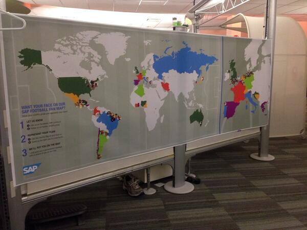
Join the SAP World Cup Fan Engagement Viz-Map
The SAP DataViz team in Vancouver has created a physical infographic for World Cup fan engagement, here’s the latest view of the viz-map live from SAP Vancouver:
Check out details on how to join the World Cup fan engagement map >
What’s Next?
Next week we will be sharing more analysis and World Cup team insights including:
- Tournament stage predictions
- Stadium analysis with SAP Lumira and ESRI maps
- Mobile message analysis by country during the World Cup with SAP Lumira and SAP Mobile Services
Join World Cup Fever!
Share your insights and analysis with SAP Lumira and show your World Cup country spirit, learn how to join at www.sap.com/soccer-analysis and follow @SAPLumira on Twitter for updates.
