Probably no one in the UX field has escaped the numerous papers and blog posts around Jakob Nielsen’s claim that
5 users suffice to run effective usability test. Numerous others have stated the exact opposite, that 5 users are
nowhere near enough. No, I don’t want to add more of the same – for the interested reader, detailed and thoughtful treatments of the matter have been provided by
Jeff Sauro,
Alan Dix,
Jim Lewis and others. The bottom line of the discussion, as often, is “it depends” – on a lot of factors. Many of them you don’t know at the beginning of a usability study, so most of us practitioners simply go ahead, invite a bunch of participants and start testing. But when is it that you have seen enough? When is inviting more test participants actually worth the effort? What would you actually get out of the next, say, 5 participants?
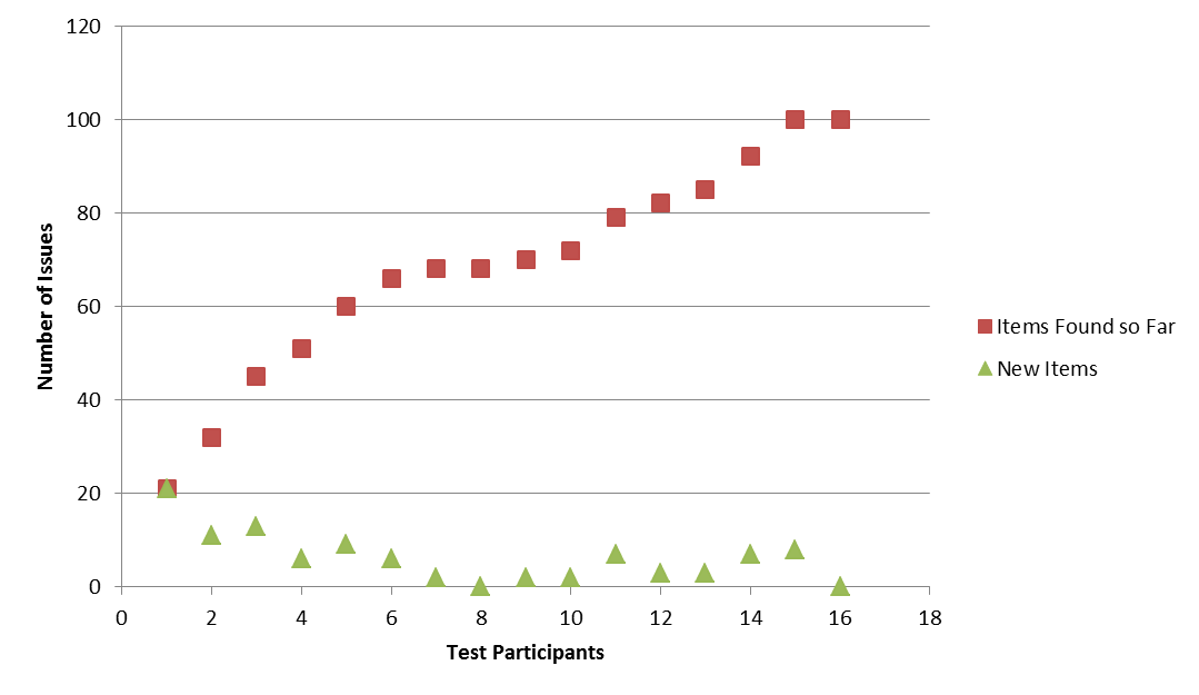
Recently I looked through a couple of our internal test results and tried to think of a pragmatic approach to answer this question. It is an almost trivial observation that after testing with a number of participants, additional ones will contribute fewer and fewer new observations. Figure 1 shows a typical example: the number of issues found increases with the number of users who participated in the test so far, but the slope of the curve – issues added per test participant – is declining. The math behind this phenomenon however is not trivial – even the famous
Nielsen-Landauer formula is not exactly simple, and more sophisticated and exact approaches like the one proposed by
Martin Schmettow can be downright scary to the mathematically less initiated. But, can’t we simply fit a curve to those wiggly data points, that approximates the data well enough to make pragmatic decisions?
To further investigate this approach, I tried three function families that have the typical negatively accelerated shape of Figure 1, and that are easy to calculate: the logarithm, square root, and cubic root. It turned out that (don’t ask me why) the cubic root worked best – consider Figure 2. This plot shows data from four different usability tests. In all cases the model fit is excellent (for statisticians: the cubic root model explains more than 97% variance). You can also see in Figure 2 that the different test approaches yield different numbers of issues per participant. The formative test, which followed a protocol designed to elicit a maximum of observations per user, in fact had the highest detection rates. The mobile test, which was performed on a fairly high-quality UI, yielded the lowest number of observations per participant. The two other summative tests – quantitative usability assessments of user interfaces with no particular focus on issue detection – were in between.

Here’s how to create such a plot:
1) Calculate the cubic root for 1..N (in Excel: =[cell reference to N] ^(1/3))
2) For each test participant from 1 to N, determine the number of issues you found so far
3) Plot 1 vs. 2 (in Excel, using a scatterplot is easiest), and add a trendline to the plot. In Excel, you can also display the regression equation and its R² value in the plot.
Now what’s the point of all this?
With as little as 5 participants, you can estimate from the data you already collected, how many additional issues you’ll find when you continue testing in the same setup. All you have to do is to create the plot, paste the regression equation from the plot in your spreadsheet, and exchange x with the reference to the cubic root of the participant number (1). The R² figure in the plot tells you to which extent you can trust your prediction – be careful with anything < 0.90. Figure 3 shows the data from Figure 1 together with the data predicted using a cubic root model calculated from the first 5 participants. The model equation for this case is (R²=0.99):
[Predicted Number of Issues] = 55*(N^1/3) – 35,195

Figure 3 shows a number of things. First, the prediction is accurate enough for all practical purposes. Second, had we stopped testing with participant 5, we’d have missed 40 issues. Had we stopped after the rate of new observations dropped with participants 7-10, we’d still have missed roughly 35. Third, the model predicts that you’d need to see 78 users before you can expect to discover less than one new observed issue per additional participant.
The bottom line: if, in the process of a usability test, you track the number of new issues detected for each participant, two more rows in your Excel sheet give you a pretty strong prediction of what to expect when you see more users. If your model predicts a high number of additional issues per participant, continue. When the detection rate eventually declines, stop testing, wrap up and report what you have.
And if someone wants to stop
you testing, show them how much they’ll miss ?
Sounds easy, doesn’t it?
