In Part 1 of this blog I introduced you to SA Power Networks, an Australian utility company, who used best practices to implement four dashboards in five months resulting in a 3% savings of spend throughout the life of a supplier contract. That blog covered the BI Dashboard Formula (BIDF) planning, scoping and customer enchantment that laid the foundation of success. Now the story continues with how the BI team drove a fast and efficient prototyping process and used data visualization best practices for an elegant and usable final result.
How to quickly move to an agreed upon prototype
SA Power Networks accomplished the near impossible feat of moving from project launch through planning, scoping and to mock-up of the four dashboards with 20 KPIs in only five weeks. Yes you read that right – only five weeks for four dashboards. A key component was the BIDF recommended use of wireframing tools such as Balsamiq. “It can save you a lot of time” explained the BI team, “two or three days minimum per mockup which adds up quickly if you are going back and forth with your end users.” Using this tool they were able to get a final copy of all four dashboards in four days. It is recommended to never do the prototype in the actual dashboard solution as this takes far too much time.
Great visualizations
Demonstrating to the clients that they were using BIDF best practices for their visualizations helped to build credibility with their customers. One key differentiator in their process, was to focus on getting sign off from the customer on the layout and functionality before discussing color. This helped them be very effective at taking the corporate branding guide and applying it consistently and attractively to the dashboards, eliminating the frequent color change nightmare that many projects encounter.
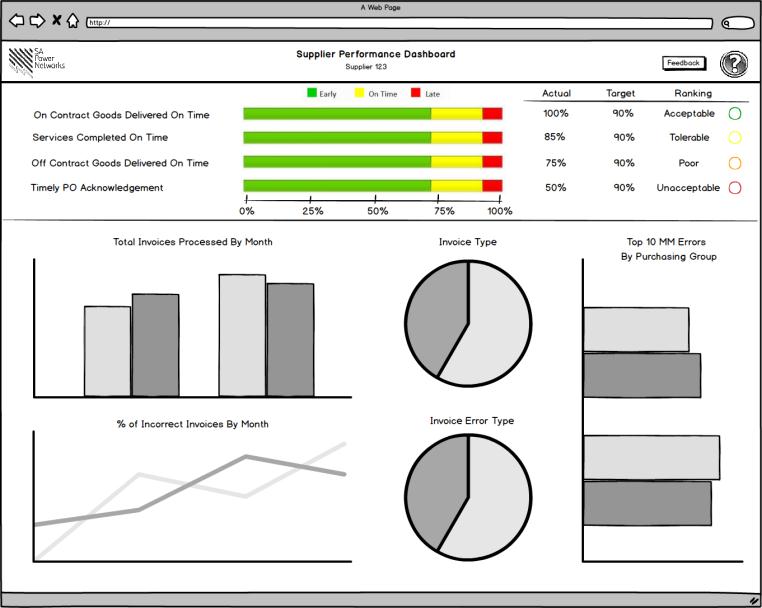
The BI team was very effective in educating the users on how best practices for data visualization call for simplicity (not overcrowding), use of white space, restricting pie charts and laying out dashboards to tell a story to help make them easier to read. Using the tool they enabled the end user to personalize their dashboard by selecting pie or bar chart. The executives loved the flexibility.


The business benefits
The Procurement team needed a data focused business intelligence platform to facilitate three activities in driving savings:
- Provide supplier spend, delivery, quality, service and safety information to facilitate a formalized supplier performance feedback process.
- Provide spend and contract management analytics to ensure supplier contracts are proactively managed during their lifecycle to ensure maximum value is achieved from the relationship.
- Provide the ability to aggregate and disaggregate spend data across suppliers and categories of spend to facilitate a data driven strategic sourcing process.
It is expected that the use of this data will provide a savings uplift of potentially 3% of spend throughout the life of a supplier contract as this will allow the team to proactively manage supplier performance information to ensure they are conforming to all clauses and KPIs in their contract. In addition, there is an intangible benefit to be derived in the strategic sourcing process as this will enhance the data analysis the team must do to understand their spend with the suppliers and where they are positioned in the market.
Reaping the fruit of Success!
SA Power Networks BI team built four dashboards that drove savings of 3% on spend because they were a union of usability, utility and beauty. The dashboards were delivered in a timely manner in just over four months so that changes in leadership, strategy and funding couldn’t derail their project. The BI team emphasized how important the BI Dashboard Formula had been in giving them frameworks, templates and best practices. The success of the project has increased business confidence in IT, paving the way for other successful cooperative projects between business and IT.
SA Power Networks uses SAP BusinessObjects Dashboards 4.0 SP4 on top of SAP NetWeaver Business Warehouse 7.3.
