Clustering is your answer when looking for similarities between records. Often you do not know how many clusters of similar records you have in your data or what makes them similar. There are a number of different algorithms available to answer those questions, this article adds "Hierarchical Clustering" to SAP Predictive Analysis.
Hierarchical Clusters are often used, because they
- help identify how many clusters you want to break your data into.
- can be nicely displayed in charts that help understand the differences between the individual clusters.
Please scroll to the bottom of this page for instructions on implementing this function and for a sample dataset to carry out some first hierarchical clustering. We will look for similarities of how happy people are living in 75 major European cities.
If you are new to creating Custom R Components in SAP Predictive Analysis, you can have a look at this overview to get you started.
Smallprint: When using this code, please carry out your own testing and let me know in case you find any surprises.
Background
The similarity of records is calculated by a multivariate distance measure. To ensure the results do not get distorted, the variances of the measures should be fairly similar. You can check on this with your data in a boxplot. If a transformation is necessary, you can scale the data with this "Hierarchical Clustering" component.
Once the distances have been calculated, there a are number of different methods to carry out the hierarchical clustering. You can switch between these by changing this component's graphical configuration.
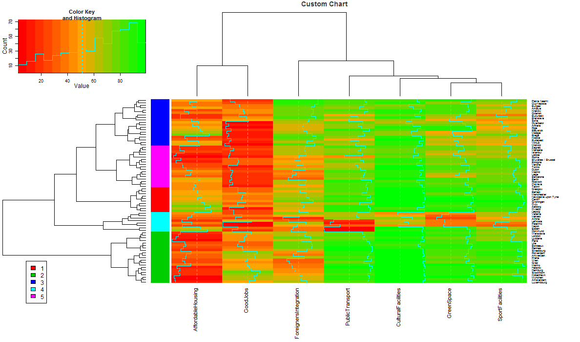
The result is displayed as a chart. The dendogram on the left indicates how different the records and clusters are from each other. The longer the line, the larger the difference. Such a dendogram can be a great help to decide how many clusters you want to work with. Here 5 clusters were asked for. These are indicated by the 5 colours in between the dendogram and the heatmap.
Usage
First of all you have to implement add this Custom R Component to SAP Predictive Analysis as described in the "R Code" and "Configuration" chapters below.
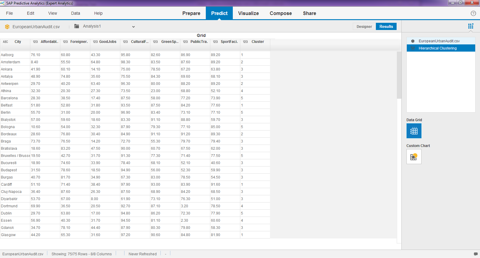
Now load the dataset EuropeanUrbanAudit.csv into SAP Predictive Analysis. The file contains a small part of as perception survey done by Eurostat in 2009 about the quality of life in 75 different European cities. Categories that were asked for are (in abbreviated terms): Affordable Housing, Availability of Good Jobs, Integration of Foreigners, Satisfaction with Public Transport, Cultural Facilities, Sport Facilities and Green Spaces. The number indicates a synthetic index of satisfaction (0-100). So the higher the value, the more satisfied people are.

Now add the new "Hierarchical Clustering" component to your model.

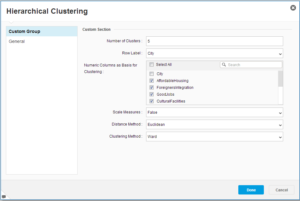
Configure the component. You need to set the following:
- The number of clusters.
- Column that holds a label for each row.
- Numerical columns on which the clustering will be based.
- Whether the data needs to be scaled.
- Distance method.
- Hierarchical clustering method.
Run the model to carry out the clustering. You will see a new column with the assigend cluster number has been added.
Click on 'Charts' and you see the full image with the results. Each cell indicates the level of happiness for a city by category.

First look at the additional dendogram on top. This shows the similarity between the numerical input column. The two columns on the right are very similar (the length of the connecting line is short). They show Sport Facilities and Green Spaces. So when people are happy with Green Spaces they are also happy with the Sport Facilities, which makes good sense. On the left hand side you see two columns that are very distant. They show Affordable Housig and Good Jobs. That indicates the availability of good jobs pushes up the housing prices, which also makes sense.
The dataset holds so many cities, that is is hard to see the individual names. You can get a closer look at the cluster assignments in the 'Visualize' tab. We see that for instance Aalborg, Belfast, Cardiff, Glasgow and further cities were assigned to Cluster 1.

To get a better picture of the characteristics within a cluster you can run a decision tree on the data. I am using the "R-CNR Tree" you might be familiar with. Interestingly, the satisfaction with Sports Facilities gives the highest information gain for identifying the clusters. Cluster 1 is on the bottom left. Follow the tree and you see that in Cluster 1 we have cities on the upper split of Sport Facilities, Good Jobs and Affordable Housing. Sure, this is still a very high level look at those data, but the cities in Cluster 1 sound very pleasant so far!

How to Implement
The component can be downloaded as .spar file from GitHub. Then deploy it as described here. You just need to import it through the option "Import/Model Component", which you will find by clicking on the plus-sign at the bottom of the list of the available algorithms.
Disclaimer
Please note that this component is not an official release by SAP and that it is provided as-is without any guarantee or support. Please test the component to ensure it works for your purposes.
