Hello Everyone,
My post for the Data Geek Challenge is about music. I’ve picked a list of some of the best rock’n’roll history album with their sales numbers in millions. So here is the data I used for this blog:

I have taken this information from this website, then I imported the spreadsheet data to Lumira, and this is how it looked:

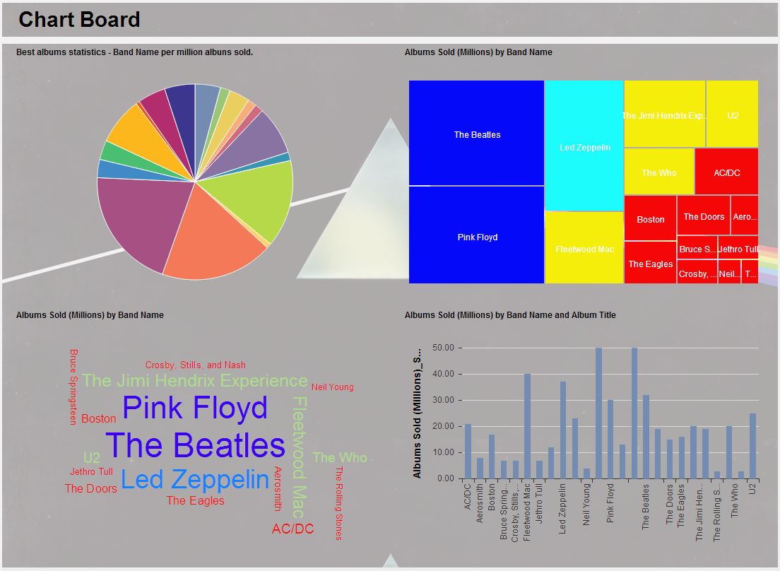
Then I created some charts, like this pie bellow. Here you can see that The Beatles, Pink Floyd and Led Zeppelin have more than 50% of the sales share among the selected albums.

The tree map illustrates the same, but is ordered in a different way and the color scheme is by sales number.

The tag cloud is also interesting, the sales data is grouped by band here, so there you can see the different colors the bands were classified, in this case the same way as in the tree map.

The bar chart has the information split into albums, so you can see that some bands have more than one.

Just to complete, I create this chart board.
Hope you like it.
Cheers,
Thiago
