Skip to Content
Author's profile photo Timo ELLIOTT

What Are Infauxgraphics?

Infographics are visual representations of information, data or knowledge intended to present complex information quickly and clearly. They are incredibly popular in social media, because they work. Here are some of the favorite infographics of Fast Company magazine. And there are, of course, infographics about infographics – even interactive ones.

But what turns an infographic into an infauxgraphic? If it’s ugly, silly, misguided, or misleading.

Ugly

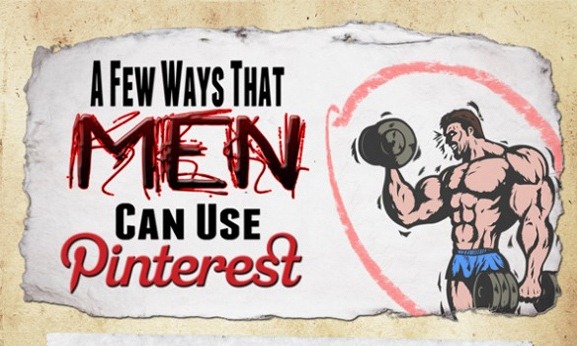
Some infauxgraphics are just really ugly.

ugly infauxgraphic

ugly infaugraphic2

Silly

Some infauxgraphics may just be silly or funny.

Check out our July enewsletter to se our new B-to-B Marketing InFAUXgraphic: 6 things people accomplish during boring webinars

Misguided

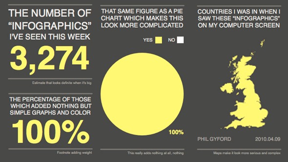
Infauxgraphics may be misguided, and fail in the mission by concentrating on graphic design rather than information design. This is by far the most common problem: the design is visually arresting, but gets in the way of understanding, using pointless or uninteresting facts. Here’s a great spoof adapted from a piece by Phil Gyford – click to see the original in its full glory.

infauxgraphic banner

Misleading

Worst of all – and heavily used in any area that is even mildly controversial – an infauxgraphic may be unintentionally or deliberately misleading.

Please be merciful to us all – if you have to make infographics, please make sure they’re not infauxgraphics!

Assigned Tags

      3 Comments
      You must be Logged on to comment or reply to a post.
      Author's profile photo Former Member
      Former Member

      "If you have to make infographics..." - sounds like you're not really a fan, Timo. Personally, I find a lot of infographics quite cluttered and visually overwhelming, which makes it hard work to understand what they're actually trying to say. This is probably related to your "misguided", where people are more concerned about making something look good than actually getting a good message across in the simplest possible way.

      Author's profile photo Bret Halford
      Bret Halford

      Recommended reading related to this topic:

      The writings of Edward Tufte, particularly "The Visual Display of Quantitative Information", "Visual Explanations", and "Envisioning Information".

      http://www.amazon.com/Edward-R.-Tufte/e/B000APET3Y

      "How to Lie with Statistics" by Darrell Huff

      http://www.amazon.com/How-Lie-Statistics-Penguin-Business/dp/0140136290

      "How to Lie with Maps" by Mark Monmonier and H.J. de Blif

      http://www.amazon.com/How-Lie-Maps-Mark-Monmonier/dp/0226534219

      "How to Lie with Charts" by Gerald Everett Jones

      http://www.amazon.com/How-Charts-Gerald-Everett-Jones/dp/1419651439

      Author's profile photo gian tapia
      gian tapia

      I thank you very much for the data and information, because it was of great help to me for some jobs that I had pending for the university.It is not so easy to get this information, thank you for this

      If you like it, you can visit my work done web