
- SAP Community
- Groups
- Interest Groups
- Application Development
- Blog Posts
- LOGOS IN THE NEWS: PRISM
- Subscribe to RSS Feed
- Mark as New
- Mark as Read
- Bookmark
- Subscribe
- Printer Friendly Page
- Report Inappropriate Content
I can just hear it. They had been working on this project for a while now. It was so innovative, it was so cutting edge. I’m sure the term “game changer” was invoked. At an agency often considered slow moving and ineffectual, this would indicate their intellectual renewal. So, they would have to have an equally innovative logo to promote this internally. It would probably never be seen by the general public, it’s just internal. It won’t compete with the main logo of the parent organization. This won’t detract from its equity. Don’t worry. Or, maybe it will, maybe this will be so groundbreaking that it will set the new standard for the brand and the rest of the organization, recognizing its brilliance, will abandon their current identity and adopt this new look and feel.
It must have gone down like this one day in 2007 at the National Security Administration. It probably was an email from the project owner to the internal graphics department, and so designers set to work to come up with something new, something different. Hip and cool were presumably part of the brief.
On Thursday, June 6, 2013, the fruits of their labor did indeed go external when The Washington Post and the Guardian revealed PRISM, the NSA data-mining program. The question is, did the designers deliver on the brief?
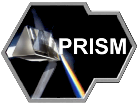
Initial impressions would have to say yes. This metallic, hard edged, science fictiony image does indeed distinguish itself from the NSA masterbrand seal. The NSA seal is a traditional government/military affair. Designed in 1965, it features a bald eagle looking to its right, clutching a skeleton key as a symbol of its clutch on security and its mission to unlock secrets and, I suppose, keep them locked from the prying eyes of citizens. A blue background, and a shield on the eagle with a blue band and 13 red and white stripes. I suppose one notable, modern feature might be the choice of typeface. It is Herman Zaph’s Optima, designed between 1952 and 1955. Technically classified as a sans serif, the slight swelling in the terminals suggest the effect of a serif, a humanist san serif. Not what one would expect in a national security context at all.
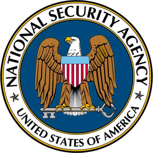
The NSA seal was designed in 1966 by Agency graphic designer Richard Nachman who was summoned to the office of the NSA Director, LTG Ralph Carter and asked to create a new emblem, “something unique”. Nachman claimed the final choice of colors was made for aesthetic reasons; they looked good together. It’s hard to imagine this was the sole criterion. In heraldry, red connotes valor, blue stands for vigilance, perseverance, and justice, and white conveys purity. And Nachman probably wasn’t the first to discover these three colors look good together; you might recognize the same color palette on the U.S. flag.
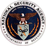
This seal, still in use today, departed from the design of the original seal of 1963 by an unnamed designer. The 1963 version also employs the aesthetically pleasing color palette of red, white and blue with the addition of gold. It is a more complex image, the eagle has its wings outspread, holding a shield with three links of a chain, the key, and a lightning bolt. Four more lightning bolts radiate from the shield. Department of Defense was set in type along the bottom, as the NSA is an agency of the Department. LTG Ralph Carter had that changed to United States of America to emphasize that its mission was national in scope.
Given this context and heritage, the PRISM logo is a huge departure. First, the holding shape. Metallic and angular, yet symmetrical, but not quite. Is it a porthole on some starship? It’s not sharp enough to be a ninja-style throwing weapon, but there is something ominous and threatening about it in a way an eagle in a circle isn’t.
And there is a photograph inside the frame, highly unusual for a logo. Logos are often the representation of an idea reduced to a graphic purity of simple forms and colors. What is represented in the photograph is not an idea of PRISM, but a prism itself. The idea of refraction isn’t deconstructed or abstracted into its essence. In logo design, shapes are explored and refined to tell a story in an instant, not provide a narrative.
Here are a few logos of Fortune 500 companies that employ recognizable forms. Citigroup, for example, conveys a sense of security and protection with the graphic shape of an umbrella pared down to its essential form, Cisco represents its roots with a representation of the Golden Gate Bridge, and Shell, well, you get it. None of these globally recognized logos require a photograph of an object to convey their meaning.

Moving on to the typography in the PRISM logo. There were some amazing typefaces debuting in 2007. Certainly, not all would be appropriate for a top-secret program authorized by federal judges working under the Foreign Intelligence Surveillance Act. Here are a few san serif samples from Typographica’s Favorite Typefaces of 2007, curated by 25 of the world’s notable graphic and type designers. One of these might have been able to convey the innovative nature of the PRISM program. But instead, what do we have? Arial. Designed in 1982, primarily as a computer font, Arial is more humanist than many of its more mechanical san serif predecessors such as Helvetica and Univers. Robin Nicholas, the typeface’s designer said of Arial "It was designed as a generic sans serif; almost a bland sans serif." This generic, almost bland san serif comes packaged in all versions of Microsoft Windows and Mac OSX. It is virtually on every computer in the world. The designer of the PRISM logo didn’t have to look far to find Arial, it was sitting there near the top of the font menu on his computer. And it is free.

Now, the photograph of the PRISM logo also was a freebie. Shot by Adam Hart-Davis, photographer-woodworker-world traveler-writer-broadcaster-member of the British Toilet Association, the image can be downloaded for free.

Back to that puzzling metallic holding shape. What is it meant to convey? What was in the brief? What were the attributes of PRISM that were a point of departure to guide the designers? Assuming this is as classified as the entire program, we are left to our own wits. Perhaps there is a Star Trek reference here, but one other logo from contemporary culture starts to resonate. It seems to have the same vocabulary of 45 degree angular forms, the same chrome effects acting as a border.
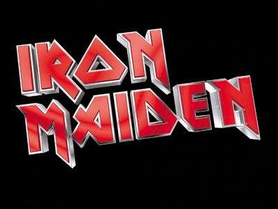
Although band member Steven Harris lays claim to designing the type for the Iron Maiden logo, credit usually goes to Vic Fair, a British film poster designer, for his typography for the David Bowie film, The Man Who Fell to Earth.

Turning to the photograph in the PRISM logo, where in our collective memory have we encountered that?
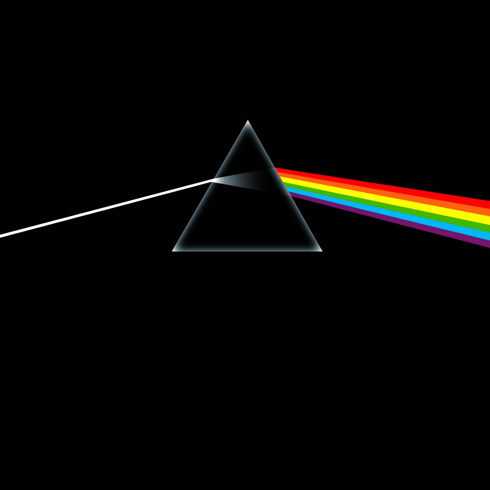
Pink Floyd’s Dark Side of the Moon, debuting in 1973, topped the Billboard Top LPs & Tapes chart for only one week, but it then remained in the charts for 741 weeks from 1973 to 1988. Approximately 50 million copies were sold making it one of the world’s best-selling albums. The album cover was designed by Storm Storm Thorgerson and his studio, Hipgnosis. Storm passed away in April of 2013.
I believe our National Security Agency designer on the PRISM project is a rocker.
I hope the designer takes some satisfaction that this secret logo has been displayed in major media outlets. How do taxpayers feel about this piece of design? After all, it is an example of tax dollars at work. Do citizens take some comfort that the identity for this top secret program cost very little and the NSA was being a wise steward of public funds with their secret, yet estimated annual budget of $10 billion? Not a dime was spent for the typeface and the photograph was equally available for free. Or do people feel cheated? Does this identity deserve greater care, appreciation and craft? The logo does represent a technology brand, an extremely sophisticated and highly innovative program that potentially touches each and every one of us in ways we may never realize. PRISM is adjudicated by the Foreign Intelligence Surveillance Court. Its hearings are closed and proceedings classified. Recently leaked documents imply PRISM enabled direct access from the servers of of these US companies: Microsoft, Yahoo, Google, Facebook, Paltalk, AOL, Skype YouTube and Apple. Executives of these companies expressed shock and denied such allegations. Of course, if they were acting under FISC orders, they would be prohibited from admitting it.
Any way you look at it, this is a seriously disturbing logo.

- SAP Managed Tags:
- Design Thinking
You must be a registered user to add a comment. If you've already registered, sign in. Otherwise, register and sign in.
-
A Dynamic Memory Allocation Tool
1 -
ABAP
8 -
abap cds
1 -
ABAP CDS Views
14 -
ABAP class
1 -
ABAP Cloud
1 -
ABAP Development
4 -
ABAP in Eclipse
1 -
ABAP Keyword Documentation
2 -
ABAP OOABAP
2 -
ABAP Programming
1 -
abap technical
1 -
ABAP test cockpit
7 -
ABAP test cokpit
1 -
ADT
1 -
Advanced Event Mesh
1 -
AEM
1 -
AI
1 -
API and Integration
1 -
APIs
8 -
APIs ABAP
1 -
App Dev and Integration
1 -
Application Development
2 -
application job
1 -
archivelinks
1 -
Automation
4 -
BTP
1 -
CAP
1 -
CAPM
1 -
Career Development
3 -
CL_GUI_FRONTEND_SERVICES
1 -
CL_SALV_TABLE
1 -
Cloud Extensibility
8 -
Cloud Native
7 -
Cloud Platform Integration
1 -
CloudEvents
2 -
CMIS
1 -
Connection
1 -
container
1 -
Debugging
2 -
Developer extensibility
1 -
Developing at Scale
4 -
DMS
1 -
dynamic logpoints
1 -
Eclipse ADT ABAP Development Tools
1 -
EDA
1 -
Event Mesh
1 -
Expert
1 -
Field Symbols in ABAP
1 -
Fiori
1 -
Fiori App Extension
1 -
Forms & Templates
1 -
IBM watsonx
1 -
Integration & Connectivity
10 -
JavaScripts used by Adobe Forms
1 -
joule
1 -
NodeJS
1 -
ODATA
3 -
OOABAP
3 -
Outbound queue
1 -
Product Updates
1 -
Programming Models
13 -
Restful webservices Using POST MAN
1 -
RFC
1 -
RFFOEDI1
1 -
SAP BAS
1 -
SAP BTP
1 -
SAP Build
1 -
SAP Build apps
1 -
SAP Build CodeJam
1 -
SAP CodeTalk
1 -
SAP Odata
1 -
SAP UI5
1 -
SAP UI5 Custom Library
1 -
SAPEnhancements
1 -
SapMachine
1 -
security
3 -
text editor
1 -
Tools
16 -
User Experience
5
| User | Count |
|---|---|
| 6 | |
| 5 | |
| 3 | |
| 3 | |
| 2 | |
| 2 | |
| 2 | |
| 2 | |
| 1 | |
| 1 |