
- SAP Community
- Groups
- Interest Groups
- Application Development
- Blog Posts
- Some People Talk About Being Innovative . . .
Application Development Blog Posts
Learn and share on deeper, cross technology development topics such as integration and connectivity, automation, cloud extensibility, developing at scale, and security.
Turn on suggestions
Auto-suggest helps you quickly narrow down your search results by suggesting possible matches as you type.
Showing results for
dennis_thomas2
Explorer
Options
- Subscribe to RSS Feed
- Mark as New
- Mark as Read
- Bookmark
- Subscribe
- Printer Friendly Page
- Report Inappropriate Content
04-15-2013
3:15 AM
Yes, this is the era of innovation; we’re all talking about it, reading about it, hope we’re doing it; especially in the technology field. In its most recent Annual Report, SAP uses the word innovation 127 times. Philips, the world’s largest manufacturer of lighting as well as consumer lifestyle and health care products, mentions its commitment to innovation 201 times. And Zumtobel, the international lighting giant mentions it a mere 5 times.
We might tend to conclude from this that Philips is outrageously innovative, SAP is up there too, and Zumtobel, well, they’re hardly innovative at all.
Agreed, this is a small sampling, not very rigorous, and perhaps even implying we can measure a company’s innovation by such means is absurd. Granted. And yet, every day we encounter infographics and statistics that don’t tread all that far from the idea.
It’s one thing to talk about innovation, it’s another thing entirely to demonstrate it in an emotional, even visceral way. Zumtobel hardly talks about innovation in their annual report, but demonstrate it on every page. Their most recent annual report was designed by the agency Brighten the Corners and has been nominated for Design of the Year by the Design Museum of London.
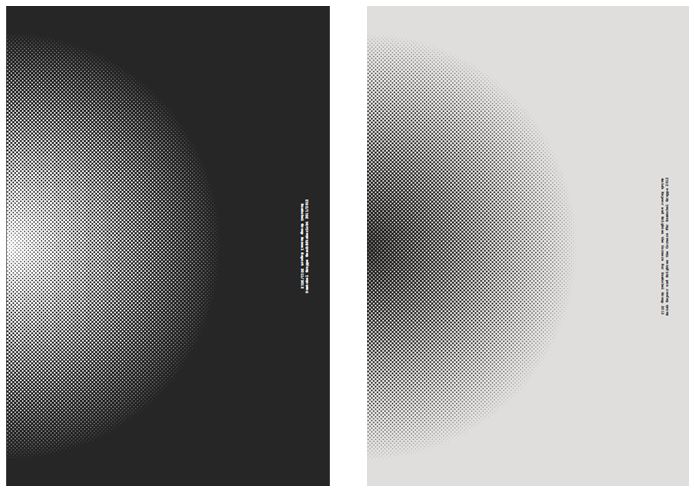
The report was produced in two volumes. Both volumes share a black and white cover, one the reverse of the other. The first page of volume one lets you know that something is up, that this is not your usual annual report. On this page is a single word (in English and German, the report is dual language). That word is “On”; the word we use to describe the active state of a light bulb. The type is exceedingly small, 8 point type, rotated 90 degrees from its usual orientation. The type face is Courier; a mono-spaced, slab serif font designed in 1955 to resemble the character of strike-on letterforms of a traditional typewriter. It is not a high tech font, it is meant to look a bit crude, raw and immediate.
The first volume contains all those elements we expect in an annual report; a letter from the CEO, facts, figures, and a consolidated financial statement. What is not expected, beside the Courier font is the way type is used on the page. The type creates a bold image, 3 columns per page, each column ascending or descending in length, depending on whether it is a right- or left-hand page. All the type remains one size; there are no bold headings, no italics. The pages are sparse, almost brutal.

These are pages of facts and figures about Zumtobel’s performance. They are meant to be true and objective, they are not meant to be pretty. The approach Brighten the Corners took is, these are facts, facts are black and white, facts speak for themselves, as designers let’s not interfere with that, let’s not spruce it up with full color photography, let’s not interrupt it with unnecessary typographic conventions, let’s not make it look like a magazine selling luxury good. Keep it clean, simple, black and white. It’s not undersigned at all, rather it is specifically designed to reflect a point of view on the content, and lets the content speak on its own, in its own voice. This is what all good typography does.

Volume two embraces the nature of Zumtobel’s products; light. Not physical lighting products but light itself. Anish Kapoor, the internationally renowned artist was commissioned to produce a print piece that has light as its sole content. With accomplishments too numerous to list, he is perhaps best known in the U.S. for Cloud Gate in the Millennium Park in Chicago. He also collaborated on the ArcelorMittel Orbit for the 2012 Summer Olympics.

For Zumtobel, Kapoor produced 43 pages of imagery based on his 1998 video work Wounds and Absent Objects. Printed in ten colors of neon ink, the second volume is calm and silent. Colors emanate from the center of each spread, continually transforming into new glows and auras. It does in print what Zumtobels lighting products do. Their LED lights allow you to change color, intensity and spread angle, and this capability is captured in the second volume. The power of color and light radiates from every page.


This ability of Zumtobel to take the essence of its products and present it as the experience of light is as innovative as its decision to present it factual material as plain, unadorned facts.
But how innovative is this when we all know print is dead?
Walter Benjamin, German philosopher and member of the Frankfurt School wrote about the revolutionary power of the recently outmoded. That which has been discarded by culture and reduced to ruin contains the possibility of being redeemed precisely because it has stepped outside of the realm of the useful. Only the abject, discarded object has the power to allow us to look at the present because of its distance from the present.
So print is dead, we’ve been hearing that for a long time. But that quality of being dead allows us to revisit the medium and see it in a new light. Print was once commonplace, then it became obsolete. This makes it also increasingly rare. Rarer still is a printed piece like the Zumtobel Annual Report. With its ten neon inks, immaculate printing and fine paper, it becomes a rare and special experience, one that differs greatly from an online equivalent. It doesn’t mean print isn’t dead, but it does force us to consider what experience is in a new light. And this decision to issue the Zumtobel Annual Report in the form they did shows some innovative thinking that few other companies dare to engage.
It’s true that Zumtobel hardly mentions innovation in its annual report; they prefer to communicate their innovation in another way, as a powerful emotional experience that steps well outside of convention. What’s interesting is that they do it without narrative when storytelling is clearly the rage in the branding world. They are not crafting an innovation story here, there’s no story arc, no beginning, middle and end, no protagonist, conflict or resolution. What is it then? It is just some thing that raises questions and allows you a new experience utilizing an outmoded form.
- SAP Managed Tags:
- Design Thinking
You must be a registered user to add a comment. If you've already registered, sign in. Otherwise, register and sign in.
Labels in this area
-
A Dynamic Memory Allocation Tool
1 -
ABAP
9 -
abap cds
1 -
ABAP CDS Views
14 -
ABAP class
1 -
ABAP Cloud
1 -
ABAP Development
5 -
ABAP in Eclipse
2 -
ABAP Keyword Documentation
2 -
ABAP OOABAP
2 -
ABAP Programming
1 -
abap technical
1 -
ABAP test cockpit
7 -
ABAP test cokpit
1 -
ADT
1 -
Advanced Event Mesh
1 -
AEM
1 -
AI
1 -
API and Integration
1 -
APIs
9 -
APIs ABAP
1 -
App Dev and Integration
1 -
Application Development
2 -
application job
1 -
archivelinks
1 -
Automation
4 -
B2B Integration
1 -
BTP
1 -
CAP
1 -
CAPM
1 -
Career Development
3 -
CL_GUI_FRONTEND_SERVICES
1 -
CL_SALV_TABLE
1 -
Cloud Extensibility
8 -
Cloud Native
7 -
Cloud Platform Integration
1 -
CloudEvents
2 -
CMIS
1 -
Connection
1 -
container
1 -
Customer Portal
1 -
Debugging
2 -
Developer extensibility
1 -
Developing at Scale
3 -
DMS
1 -
dynamic logpoints
1 -
Dynpro
1 -
Dynpro Width
1 -
Eclipse ADT ABAP Development Tools
1 -
EDA
1 -
Event Mesh
1 -
Expert
1 -
Field Symbols in ABAP
1 -
Fiori
1 -
Fiori App Extension
1 -
Forms & Templates
1 -
General
1 -
Getting Started
1 -
IBM watsonx
2 -
Integration & Connectivity
10 -
Introduction
1 -
JavaScripts used by Adobe Forms
1 -
joule
1 -
NodeJS
1 -
ODATA
3 -
OOABAP
3 -
Outbound queue
1 -
ProCustomer
1 -
Product Updates
1 -
Programming Models
14 -
Restful webservices Using POST MAN
1 -
RFC
1 -
RFFOEDI1
1 -
SAP BAS
1 -
SAP BTP
1 -
SAP Build
1 -
SAP Build apps
1 -
SAP Build CodeJam
1 -
SAP CodeTalk
1 -
SAP Odata
2 -
SAP SEGW
1 -
SAP UI5
1 -
SAP UI5 Custom Library
1 -
SAPEnhancements
1 -
SapMachine
1 -
security
3 -
SM30
1 -
Table Maintenance Generator
1 -
text editor
1 -
Tools
18 -
User Experience
6 -
Width
1
Top kudoed authors
| User | Count |
|---|---|
| 4 | |
| 3 | |
| 3 | |
| 2 | |
| 2 | |
| 2 | |
| 1 | |
| 1 | |
| 1 | |
| 1 |