It is always easy to spot out-of-towners on the New York City subway system, they aren’t wearing black.

And now, the same is true for NBA logos. With their move to Brooklyn, the Nets have redefined their visual presence among the rest of the league and grounded themselves in their new home at the Barclay Center in downtown Brooklyn. With the help of minority team owner, Jay-Z, and inspired by the classic black and white subway signage in NYC, the Nets have released their new logo. It’s all urban, all Brooklyn. Instead of overtly trying to fit in with the pack, it
rather seeks to consciously ground itself in Brooklyn culture to build an emotional relationship with its local fans.

Take a look at a random sampling of NBA logos. They are characterized by often hand drawn, tortured type, enhanced with an italic-like dynamism, emboldened with 3-dimensional extrusions or other gimmicks. Local references are sometimes incorporated, such as literal depictions of mountains for the Utah Jazz. While colors sometime make sense, such as green for the Celtics and Cyan for Miami, it’s harder to associate blue and orange with New York or purple and yellow with Los Angeles.
Over the past decade or so, Brooklyn has truly come into its own. Aside from the born and bred Brooklynites who were always defiantly proud of their borough, it was often seen as a place you move to when you couldn’t afford Manhattan, living in exile across the East River. No longer. With the vibrant arts and music scene of Williamsburg, the rebirth of Coney Island, new housing developments along the East River, a glowing restaurant scene and the new Barclays arena, Brooklyn has become its own destination, and the new Nets logo reflects this change in perceptions.
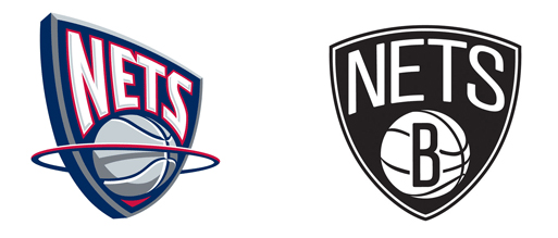
It pays homage to its previous iteration, retaining all its core elements, the basketball, the shield, the name at the top. But gone now is the rotated orientation of the shield, the 3-dimensional ball effect and the rim, or is that a halo? Now it is full frontal, in your face. It is black and white, period. To indicate this is a Brooklyn team, there is just the letter B, although versions also exist which spell out the name. No Brooklyn Bridge, no bagels, no Coney Island Parachute drop (long referred to as the Eiffel Tower of Brooklyn). It is sparse, direct, simple and bold.
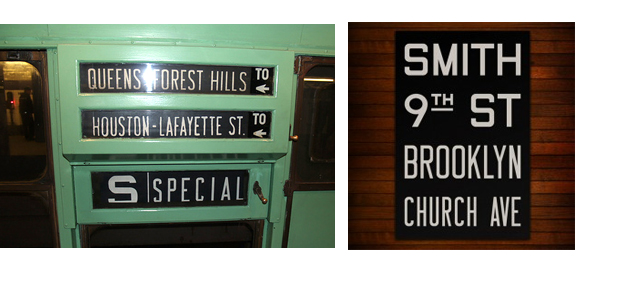
The typography references its location, based on the scroll signs that identified routes of bygone subway trains, now available as collector/decorator prints. Helvetica is the font of choice for the NYC subway system since the 60s, it evokes Manhattan and Mad Men, but Brooklyn isn’t Helvetica.
Note to design geeks: Could it have been better? Yes, it is far from perfect. Look at the NETS type, particularly witness the S in NETS, a sadly unfortunate letterform. On the right track, but lacking sensitivity and typographic refinement. A missed opportunity for greatness.
Brooklyn. Rather than adopt the usual sports-logo vernacular of flashy colors, dynamic typography, literal location references, the Nets have decided the best way to emotionally engage their audience is to appeal to Brooklyn, the borough, Brooklyn, the attitude. Where else on Earth could that possibly work?
