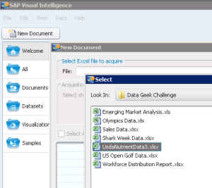
Nick Smith @Nicfish set out a Ultimate Data Geek Challenge at the beginning of September to “Let the rest of the world know your data skills”. http://scn.sap.com/docs/DOC-31008
Well, my data skills aren’t the greatest mathematically so I wanted to use this challenge to push my understanding of SAP Visual Intelligence a few stages on….. It sure did that.
I decided to use the data set of USDA Nutrient Data , which after a bit of googling is the United States Department of Agriculture Nutrient database that holds the nutritional information of numerous food and beverage products.
Step 1 – Where do I start ?
Well with Visual Intelligence (VISI) it’s extremely simple to acquire data for analysis and chop out columns you are not interested in.


Another great feature is the inbuilt enrichment of data, in this data set it is only used to create “Measures” but it is very useful for both Geographical and Date enrichment. It will in fact build out a Time and Geography hierarchy from a City or Date dimension field.

Step 2 – Have a look around the dataset
In looking around the data set it was easy to notice that a lot of information in terms of a product Hierarchy is held in the Product Description field but separate by the ‘Comma’. Traditionally this would be a nightmare for a Web Intelligence report developer to work with and would often need a service request on the DBA to split out the field into multiple fields.

In Visual Intelligence this is an easy user task and enables them to really take a ghold of their data, Split column by <Comma>.

With a few moments of renaming the Description can be split out into multiple columns to aid analysis.

Step 3 - Visualising to aid analysis
There is only so much analysis you can do by eyeballing a many thousand row spreadsheet so this is where visual analysis really aids understanding. If this Data Geek Challenge experience is anything to go by it really showed me that questions lead from question and take you places in the data you never thought you’d end up.
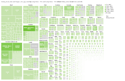
Question 1 - What food group is “Bad for me”?

Question 2 - Just How Bad ?
Spotting the outliers in a bubble chart really help understand to exceptions

But spin the axes around an a different picture forms

Question 3 – What should I really not eat?
We all know Sugar is not great for you but it seems on first look to be intrinsic to what I consider to be “Bad for me” but where should I try and lower my intake in my regular diet ?

I’m not a big candy (sweets) eater but as any parent there are loads of different boxes of breakfast cereal in the house.
Should I be worried my 4 year old son has Cheerios every day for breakfast ? It looks like yes

Question 4 – What is the worst thing to eat for breakfast?
Well, how about Cheerios with instant tea instead of milk

Question 5 – What should I eat for breakfast ?
What’s high in calories but low in sugar and I should really consider eating for breakfast?


Wheat with corn beverage ?


Appetising ? …. Maybe not
Summary
Well did I think I’d end up banning my youngest child from eating Cheerios as a result of this challenge? Absolutely not. But this challenge has certainly enabled me to get close to SAP Visual Intelligence and appreciate more that getting closer to data and putting the analysis in the hands of dare I say Data Scientists, well analysts can only be a good thing.
