
- SAP Community
- Groups
- Interest Groups
- Application Development
- Blog Posts
- Anti Patterns
Application Development Blog Posts
Learn and share on deeper, cross technology development topics such as integration and connectivity, automation, cloud extensibility, developing at scale, and security.
Turn on suggestions
Auto-suggest helps you quickly narrow down your search results by suggesting possible matches as you type.
Showing results for
hardyp180
Active Contributor
Options
- Subscribe to RSS Feed
- Mark as New
- Mark as Read
- Bookmark
- Subscribe
- Printer Friendly Page
- Report Inappropriate Content
06-20-2012
11:29 AM
A very common cliche is "what does not kill you makes you stronger".
Today I was stung very badly financially by my banks website behaving in a very strange manner which nobody could have predicted, and it makes me wonder not only how many other IT applications are behaving in a random user unfriendly manner, but more to the point, is anything that I have written in SAP causing similar problems to the users in my organisation.
So, how can I turn this around? Often people use "anti-patterns" in training, often seeing something that is clearly wrong is a better way to steer people in the right direction than just showing them things that work well.
At the risk of using a blog to describe what I had for breakfast, I am using as an anti-pattern example what happened to me today AFTER breakfast. For the last ten years I have only had one bank account and used that to pay bills. Naturally on the web site the bank account to be used defaulted to the only possible entry. Last month I made the mistake of opening a savings account. You can't use that to pay bills, nor would you want to, but that is the account that now defaults.
So, of we go, let us try to pay a bill. Let us say I have a bill from the ambulance service for taking me to the hospital to have my brain removed so I can write user interfaces.
You go into the option to pay a bill. The account defaults to the one that it is impossible to pay a bill from. You would not expect this. As it is an impossible choice you would not expect it to even be on the list, let alone default. So as you are not looking for such behaviour you don;t notice it, and proceed to enter the company you want to pay, the amount and some reference numbers.
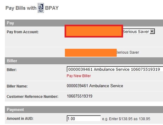
You then proceed to submit this, and naturally since the wrong account was chosen you get an error message.

You are taken back to the screen where you can do a drop down on the account. There are two options, so you take the only one that will work i.e. the one that should have defaulted in the first place.

Oh dear! The amount and timing and reference details are left unchanged but the company to whom the money will be paid has changed. No-one in their right mind would expect this, so once again you don't look to check. When you review the details you check the account it is going from, the amount, date and references, all looks good, you submit it and off goes the money to the wrong place.
Naturally, when I complain to the bank they say this is "working as designed" just like SAP do on the service marketplace when you try and notify them of a bug in standard SAP code. The second answer is that this is "user error" which of course it is, the problem is that the system guides you towards making errors rather than away from them. Then the bank tries to sell you a credit card, which thankfully the SAP service market place does not do.
Now, you might think nothing else could work as badly as what I have just described above, but thinking about it I can think of some standard SAP transactions which have behaved in odd manners.
It has been fixed now, but once upon a time fixed asset reports would only work if you put certain dates in the selection fields, but the fields did not default and you had to guess what the correct values were.
In MB51 lots of fields default using the PID mechanism, often you don't want most of them and have to manually clear some values out.
Again fixed now, but when downloading to excel from SAP a pop-up box appeared with one radio button, saying "excel".
In SE11 you cannot enter the enhancement category for a table or structure without first getting an error message saying you have not yet entered an enhancement category.
In the SCN as the "blog" is the first entry when making a post, most of the "hi gurus" people use this to post a question.
All of the above are minor annoyances rather than things that actually hurt you like the bank can, and as I said most of them in SAP get fixed eventually.
The question is, if I hate being on the receiving end, am I, as a developer, unwittingly doing the same to my users? I was happy to see that in ECC 6.0 the code inspector has a lot more checks on ergonomics, but how many people out there actually even run this check, let alone respond to it?
I recall many times, on drop downs for Z transactions, we used the standard search helps which let the user put in the standard SAP values for assorted fields, values which we did not use. It occurs to me this really needs to be looked at. If a value will result in any error, then why are we putting it on the list of possible entries? Often the answer is, although this is programatically possible, it is too much like effort, and after all does it matter? It matters to the users as can be seen above.
To sum up, whenever I encounter a problem like the one that stung me above, I wonder if I am equally guilty, and will query our key users / testers to see if they encounter similar problems in our system on a regular basis and have just learned to live with it.
If anyone else has any similar examples of badly behaving transactions in SAP, or usability lessons learnt they want to share, I am all ears.
Cheersy Cheers
Paul
P.S. I found another one today, on a website, but you could commit the same crime to your SAP users if you wanted, and maybe some developers do.
I was entering data for my German tax return into the website of a leading accounting company (one of the big four) and I had to enter various amounts relating to various receipts and expenses. The problem was I was in three countries during the year, and you can only have one default currency (naturally) so for half the amounts I had to change the currency from AUD to GBP.
If I was allowed to over-type the default AUD entry it would be take me three presses of the keyboard. However the only means of changing the currency ffrom the default is via drop down, from a list of every country in the world, so you need one mouse click and dozens of clicking on the down icon to select the one you want. And that was only getting from A to G, thank goodness I had not been working somewhere with a currency starting with Z.
Since the aim of the game is to let the user enter information as easily as posible you would want them to minimise the amount of key presses or mouse clicks, and this is the opposite of what is happening here. The simple solution is to allow direct entry as well as drop down, plus validation to make sure the value actual is a currency. To be fair to SAP, if this was an SAP search help I could use a personal value list of just my currencies, but even so overtyping would still be faster. Also you could have the system remember the last value entered via a PID.
So, after you create your SAP application, try the boring test of filling out your screen twenty times in a row, and see if any fields are harder to fill with data than others....
P.P.S. Today I found another application where you could only enter a value from a drop down of one million values, and direct entry was not allowed. this was on the SAP service marketplace, registering an object for modification.
31/05/2013 - Today I used SAP transaction ME22N and was horrified at the box that popped up after I added another line to the purchase order.

That is so wrong on so many levels. The message in the "old fashioned" transaction phased out in 2000 to make way for this "enjoy" transaction told you right away that the PO needed to be re-released. This box is TRYING to tell you the same thing, so why doesn't it?
Instead it invites you to press a button to see what the message is, without making that fact obvious at all, where does it say "press this button to see the secret message I have described?"
If the text describes the options SAVE or PROCESS then there should be two buttons called SAVE and PROCESS.
This is like the old Microsoft thing "Do you want to CONTINUE or EXIT? followed by two buttons saying YES/NO"
I put it you, that the average user would see the SAVE button and press that and not care two hoots about anything else.
In effect the box above is saying "there is a warning message which you really need to see - do you want to (a) ignore it or (b) do some incomprehensible thing you do not understand?"
Am I being too harsh on said box? Is there any way anyone thinks a user could make sense of it?
Moreover have you seen a worse one in standard SAP? I am bursting to know? Have you written a worse one yourself? Even more troubling have I written a worse one? I hope not!
Also, in the many months since I originally wrote this blog, the bank still defaults the account to the one that cannot possibly work.
- SAP Managed Tags:
- ABAP Development
8 Comments
You must be a registered user to add a comment. If you've already registered, sign in. Otherwise, register and sign in.
Labels in this area
-
A Dynamic Memory Allocation Tool
1 -
ABAP
8 -
abap cds
1 -
ABAP CDS Views
14 -
ABAP class
1 -
ABAP Cloud
1 -
ABAP Development
4 -
ABAP in Eclipse
1 -
ABAP Keyword Documentation
2 -
ABAP OOABAP
2 -
ABAP Programming
1 -
abap technical
1 -
ABAP test cockpit
7 -
ABAP test cokpit
1 -
ADT
1 -
Advanced Event Mesh
1 -
AEM
1 -
AI
1 -
API and Integration
1 -
APIs
8 -
APIs ABAP
1 -
App Dev and Integration
1 -
Application Development
2 -
application job
1 -
archivelinks
1 -
Automation
4 -
BTP
1 -
CAP
1 -
CAPM
1 -
Career Development
3 -
CL_GUI_FRONTEND_SERVICES
1 -
CL_SALV_TABLE
1 -
Cloud Extensibility
8 -
Cloud Native
7 -
Cloud Platform Integration
1 -
CloudEvents
2 -
CMIS
1 -
Connection
1 -
container
1 -
Debugging
2 -
Developer extensibility
1 -
Developing at Scale
4 -
DMS
1 -
dynamic logpoints
1 -
Eclipse ADT ABAP Development Tools
1 -
EDA
1 -
Event Mesh
1 -
Expert
1 -
Field Symbols in ABAP
1 -
Fiori
1 -
Fiori App Extension
1 -
Forms & Templates
1 -
General
1 -
Getting Started
1 -
IBM watsonx
1 -
Integration & Connectivity
10 -
Introduction
1 -
JavaScripts used by Adobe Forms
1 -
joule
1 -
NodeJS
1 -
ODATA
3 -
OOABAP
3 -
Outbound queue
1 -
Product Updates
1 -
Programming Models
13 -
Restful webservices Using POST MAN
1 -
RFC
1 -
RFFOEDI1
1 -
SAP BAS
1 -
SAP BTP
1 -
SAP Build
1 -
SAP Build apps
1 -
SAP Build CodeJam
1 -
SAP CodeTalk
1 -
SAP Odata
1 -
SAP UI5
1 -
SAP UI5 Custom Library
1 -
SAPEnhancements
1 -
SapMachine
1 -
security
3 -
text editor
1 -
Tools
17 -
User Experience
5
Top kudoed authors
| User | Count |
|---|---|
| 5 | |
| 3 | |
| 2 | |
| 2 | |
| 2 | |
| 2 | |
| 2 | |
| 2 | |
| 1 | |
| 1 |