Information design and simple charts can be tremendously powerful in teasing out unseen patterns and connections hidden in large data-sets. This is the essense of David McCandless's inspirational TED talk, posted online last week. In the talk, he explains how data visualisation and design is the best way to navigate the vast amounts of information all around us.
Throughout the talk McCandless explains why visualization is increasingly vital in a world where we as media consumers are exposed to ever increasing amounts of information:
“It feels like we’re all suffering from information overload, or data glut. And the good news is there might be an easy solution to that, and that’s using our eyes more. So visualizing information, so that we can see the patterns and connections that matter, and then designing that information so it makes more sense, or it tells a story, or allows us to focus only on the information that’s important…. Visualizing information like this is a form of knowledge compression. It’s a way of squeezing an enormous amount of information and understanding into a small space.”
Some numbers simply don’t make any sense without a visual representation in order to contextualize them. One of the interesting examples illustrated by McCandless is “The Billion Dollar-o-Gram”. McCandless input large numbers from news articles about money and budgets, and wrangled them into color-coded boxes. In the figure below, purple boxes represent money designated for “fighting,” red is “giving money away,” and green is “profiteering.” He explains how "you start to see patterns and connections between numbers that would otherwise be scattered across multiple news reports".

A couple of things jump out in the visualisation above. In the big purple box on the upper right hand side, there exists a tiny square within the rectangle. This was the predicted cost of the Iraq War back in 2003 ($60 billion). The huge rectangle surrounding it is what the Afghanistan and Iraq wars will actually cost in total ($3,000 billion, or $3 trillion). It highlights succiently the overspending that has occurred.
'Data is the new soil'
In an interesting metaphor McCandless likens data to soil:
"...data is the new soil. Because for me, it feels like a fertile, creative medium...it feels like visualizations, infographics, data visualizations, they feel like flowers blooming from this medium. But if you look at it directly, it's just a lot of numbers and disconnected facts. But if you start working with it and playing with it in a certain way, interesting thing "
Along this vein, he illustrates Clay Shirky’s theory of cognitive surplus with an graphic which brings clarity to the entire concept. The congnitive surplus relates to:
“the idea of spare brainpower of the world’s collective mind just sitting there waiting, wanting, to be harnessed,”
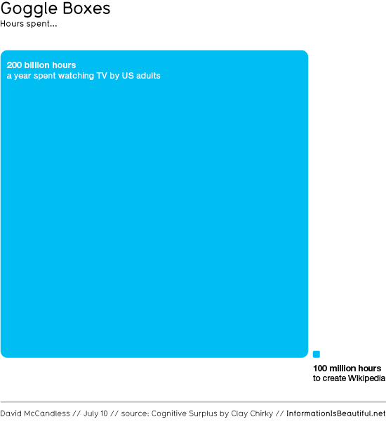
One of the questions Shirky says he always gets asked is 'Where do people find the time to edit Wikipedia'. To highlight the amount of free time available he visualised just one statistic, which brings to life what could be created if out time was spent differently.
'Something quite magical about visual information'
The talk is peppered with anecdotes about how the visual representation of information can help to reinforce its meaning and provide clarity and understanding:
'And there's something almost quite magical about visual information. It's effortless; it literally pours in. And if you're navigating a dense information jungle, coming across a beautiful graphic or a lovely data visualization, it's a relief, it's like coming across a clearing in the jungle.'
I wanted to say that it feels to me that design is about solving problems and providing elegant solutions. And information design is about solving information problems...
So, visualizing information can give us a very quick solution to those kinds of problems. And even when the information is terrible, the visual can be quite beautiful.
The talk sounds like a call to arms to utilise data more effectively; to allow it to tell a story and not to be overwhelmed by vast data volumes. In all datasets there is nuggest of clarity just waiting to escape!
For more on McCandless' visualisations visit his site at Information is Beautiful.
