
- SAP Community
- Products and Technology
- Technology
- Technology Blogs by Members
- Don't go chasing waterfalls (Or how to use "Insert...
Technology Blogs by Members
Explore a vibrant mix of technical expertise, industry insights, and tech buzz in member blogs covering SAP products, technology, and events. Get in the mix!
Turn on suggestions
Auto-suggest helps you quickly narrow down your search results by suggesting possible matches as you type.
Showing results for
Former Member
Options
- Subscribe to RSS Feed
- Mark as New
- Mark as Read
- Bookmark
- Subscribe
- Printer Friendly Page
- Report Inappropriate Content
03-24-2010
6:14 PM
Hi. You don't know me, but I know you.
That came off as a little creepy. Sorry. Before my recent activism on SCN, I contributed to the community via BOB (The Business Objects Board), via the local St. Louis BusinessObjects User Group chapter meetings, and as a member of the Global BusinessObjects Network Steering Team (which no longer exists and was merged into ASUG; take that as you will). Having done a perfectly not inadequate job at all of that, I was invited to be an SAP Mentor (details Additional SAP Mentors to cover SAP BusinessObjects)and have come on like gangbusters in the SCN Community, earning over a point a day (on average) since that post went official. Yeah, beat that.
Anyway, I've been reading SCN for a little while, but this is my first blog here (and second ever). Of course, I'm not writing here today to talk about how benevolent I am (future post material), but rather about one solution that would solve a lot of issues people have in the forums. I call this solution "waterfalling filters" and I think you should, too, because a) it isn't nearly as narcissistic as me calling it the "Oswald Maneuver" (and yes, I'm looking at you Henry Hudson) and b) it is much simpler than calling it "using the 'insert filtered rows' functionality found in most selector components in Xcelsius 2008 to start with a high level filter criteria and work down to a single row (or at least smaller result set) without querying your database like crazy" which CafePress wouldn't even let me put on a coffee mug in a readable font (full disclosure: I didn't actually try to do that. Sorry for very nearly disparaging your good name CafePress).
This thing we are trying to do here.
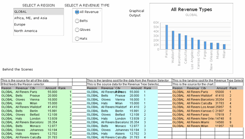
The main idea is to be able to take a big list of data and pare it down to the level of detail you need without hammering away at your QaaWS and database servers every time a user selects one region over another. Xcelsius 2008 has functionality built into most of its selector components that very quickly can help you cut down the 200 departments in your company into manageable chunks by region, vice president, or anything else. I'm attaching some screenshots from a sample model I made called "SCN Sample" (admittedly not creative, but still better than "Jamie Pays Homage to Himself in Model Form").
Imagine if you will a retail company who sells multiple product lines in stores around the world. We want to track and look at the top 10 stores for any given region by product line, but we also want to be able to look at total sales worldwide or any combination thereof. There are two parts to this trick. The first is the data, and the second is how we move it around.
Part 1: The data.
So, with Xcelsius we always want to call for/and or process as little data as we possibly can at any given time, right? Right. Sometimes anyway. Sometimes, however, if we can quickly get a lot of data processed and fed back to us, and we can efficiently move it around, it is better to call it all at once and then play with it inside our dashboard so we don't have to keep making more calls. In order for this to work, you want to bring back data in a format that is exactly how you are going to consume it in the dashboard. So, if my dashboard is at the company-wide level, I want one row returned (if my query can crunch 4 billion rows down into one in a split second, that is, quite frankly, awesome; if it can't, I need a materialized view or an aggregate table or something of that ilk so that I only need to "crunch" my one row of input into one row of output in a split second). If it is at the regional level I want one row per region. If it is at the transaction level, I need to go re-read the whole concept of a dashboard, because I don't get it.
If I need data at the company-wide level, I also need to not be afraid of having data in my result show up multiple times at varying aggregation levels. So in my final result set, I need to have 10 rows for Glove Sales for North America. I also need to have 10 rows for Glove Sales for the whole world, and every city in that top 10 for the world should be in a top 10 list for whatever region it is in. Further, I want the top rows for each Region for all Revenue Types (so, basically, net sales) and I want that for the top 10 cities globally as well. Some sample data would look like this (of course there is a lot more data in there -- like ranks 2-9 for everything, and a lot more combinations -- but you aren't reading this just to see made up data)...
| Region | Revenue Type | City | Amount | Rank |
| GLOBAL | All Revenue Types | Paris | 55000 | 1 |
| GLOBAL | All Revenue Types | Milan | 11957 | 10 |
| GLOBAL | Belts | Prague | 20000 | 1 |
| GLOBAL | Belts | Walldorf | 4874 | 10 |
| Europe | All Revenue Types | Paris | 5000 | 1 |
| Europe | All Revenue Types | Vienna | 1492 | 10 |
| Europe | Hats | Milan | 900 | 1 |
| Europe | Hats | Barcelona | 286 | 10 |
Part 2: The how we move the data around.
In order to move data around inside a spreadsheet, you must remember to ALWAYS SAVE YOUR WORK, EVEN IF WRITING A BLOG ON A WEBSITE, OFTEN. GAARGGH! As I was saying, in order to move data effectively inside a spreadsheet, we first need to set the spreadsheet up. For each selection you'll want a Source Area and a Landing Spot, and, in this case, you'll want them to overlap. So, for our two selecions (Region and Revenue Type) we'll want to start with one original source data that has everything (populated by copy/paste, SAP BusinessObjects products such as Query as a Web Service -- our old friend QaaWS -- or Live Office, XML, a temp with nothing better to do than type in numbers, etc) to be the Source Area for our region selector. That Region Selector will have a Landing Spot that will then be the Source Area for the Revenue Type Selector, which will also need a landing spot. I like to put each of these areas in the same tab (across, not down, from each other), give them different background colors, and write a ton of notes above them so I can remember later what I did (I just meet my own personal 3 free best practices quota for this blog; woo-hoo for me).
Then we have to use some actual components on an actual canvas. Because we only have a handful of options for each selection, I'll use a few Selector components that will allow me to show all of the options at once (bonus best practice; woo-hoo for you). We are moving data first based on the region they select with the power of inserting filtered rows. In our Selection Component, we use the data in the Region column of the original Source Area for our labels. We then we insert a Data Insertion series with an Insertion Type of Filtered Rows and select all of the data in the original Source Area as our Source Data and the designated Landing Spot (also the Source Area for our second component) as our Destination. I'm not going to change the name of the data insertion series because this is a sample model and I'll probably never look at it again so documentation is pointless, and I've already given you one bonus best practice. Sorry.

For our Revenue Type (which I probably should have called Product Line, but we are pretty far into this to start changing things now) I'll use a Radio Button selector and I'll choose the values from the Revenue Type column from my second Source Area (and my first landing spot) to be the labels (I also put in some "prime-the-pump" values with my distinct Revenue Types here so it doesn't look weird when you first open it up). Then I add a Data Insertion series to this component that selects the whole second Source Area (and first Landing Spot) as the Source Data and map the Destination to the second and last landing spot on our spreadsheet.

Then, all we have to do is slap a chart of some type on the last landing place and it shows us the intersection of our selections. I also like to put a spreadsheet component on here, at least at first, so I can troubleshoot the data movement if anything goes wrong (there I go again handing out free best practices). As you can see, the whole thing looks as expected whether we see the default view...
Or any combination of selections (which update really, really fast)...

Parting Shots
Obviously, this is a pretty limited example, but it displays some of the power of the "Insert Filtered Rows" functionality to quickly update visualizations when you have a limited amount of data to show but lots of quick options to give users. A few final best practices I'll give you for free (this is, after all, my first SCN blog). First, make sure you leave your Source Areas and Landing Spots plenty of room to grow (you never know when they'll want to split out Africa from Asia or start selling Shoes). Second, always carry over all of the possible data columns with you as you "waterfall down" from Source Data to Selection1 to Selection2 and on and on because A) Xcelsius was forward thinking enough to let you, and B) you'll eventually want to know what selections you've made and it is nice to have one final place to pick them all up from. Third, if you have questions, please ask them below, or in the forums and post where they are at below. You are welcome to email me from my business card, and I'll happily send you this model, but if you ask me questions I'll just ask you to post them anyway so we can all discuss it and those delicious dripping bits of our combined knowledge don't go to waste.
Finally, solutions like this will never work for everyone. You'll either have a million combinations, which is obviously too many for this technique and you'll have to query the database at runtime based on what users pick, or you'll some cockamamie requirement to do something dumb right in the middle of the process, but it is a good exercise to get comfortable with the functionality and can serve as the starting point for a great QaaWS/waterfall hybrid. Maybe you could call it a "Half-Oswald" in your documentation...
- SAP Managed Tags:
- BW (SAP Business Warehouse),
- SAP BusinessObjects Dashboards
5 Comments
You must be a registered user to add a comment. If you've already registered, sign in. Otherwise, register and sign in.
Labels in this area
-
"automatische backups"
1 -
"regelmäßige sicherung"
1 -
505 Technology Updates 53
1 -
ABAP
14 -
ABAP API
1 -
ABAP CDS Views
2 -
ABAP CDS Views - BW Extraction
1 -
ABAP CDS Views - CDC (Change Data Capture)
1 -
ABAP class
2 -
ABAP Cloud
2 -
ABAP Development
5 -
ABAP in Eclipse
1 -
ABAP Platform Trial
1 -
ABAP Programming
2 -
abap technical
1 -
absl
1 -
access data from SAP Datasphere directly from Snowflake
1 -
Access data from SAP datasphere to Qliksense
1 -
Accrual
1 -
action
1 -
adapter modules
1 -
Addon
1 -
Adobe Document Services
1 -
ADS
1 -
ADS Config
1 -
ADS with ABAP
1 -
ADS with Java
1 -
ADT
2 -
Advance Shipping and Receiving
1 -
Advanced Event Mesh
3 -
AEM
1 -
AI
7 -
AI Launchpad
1 -
AI Projects
1 -
AIML
9 -
Alert in Sap analytical cloud
1 -
Amazon S3
1 -
Analytical Dataset
1 -
Analytical Model
1 -
Analytics
1 -
Analyze Workload Data
1 -
annotations
1 -
API
1 -
API and Integration
3 -
API Call
2 -
Application Architecture
1 -
Application Development
5 -
Application Development for SAP HANA Cloud
3 -
Applications and Business Processes (AP)
1 -
Artificial Intelligence
1 -
Artificial Intelligence (AI)
4 -
Artificial Intelligence (AI) 1 Business Trends 363 Business Trends 8 Digital Transformation with Cloud ERP (DT) 1 Event Information 462 Event Information 15 Expert Insights 114 Expert Insights 76 Life at SAP 418 Life at SAP 1 Product Updates 4
1 -
Artificial Intelligence (AI) blockchain Data & Analytics
1 -
Artificial Intelligence (AI) blockchain Data & Analytics Intelligent Enterprise
1 -
Artificial Intelligence (AI) blockchain Data & Analytics Intelligent Enterprise Oil Gas IoT Exploration Production
1 -
Artificial Intelligence (AI) blockchain Data & Analytics Intelligent Enterprise sustainability responsibility esg social compliance cybersecurity risk
1 -
ASE
1 -
ASR
2 -
ASUG
1 -
Attachments
1 -
Authorisations
1 -
Automating Processes
1 -
Automation
1 -
aws
2 -
Azure
1 -
Azure AI Studio
1 -
B2B Integration
1 -
Backorder Processing
1 -
Backup
1 -
Backup and Recovery
1 -
Backup schedule
1 -
BADI_MATERIAL_CHECK error message
1 -
Bank
1 -
BAS
1 -
basis
2 -
Basis Monitoring & Tcodes with Key notes
2 -
Batch Management
1 -
BDC
1 -
Best Practice
1 -
bitcoin
1 -
Blockchain
3 -
BOP in aATP
1 -
BOP Segments
1 -
BOP Strategies
1 -
BOP Variant
1 -
BPC
1 -
BPC LIVE
1 -
BTP
11 -
BTP Destination
2 -
Business AI
1 -
Business and IT Integration
1 -
Business application stu
1 -
Business Architecture
1 -
Business Communication Services
1 -
Business Continuity
1 -
Business Data Fabric
3 -
Business Partner
12 -
Business Partner Master Data
10 -
Business Technology Platform
2 -
Business Trends
1 -
CA
1 -
calculation view
1 -
CAP
2 -
Capgemini
1 -
Catalyst for Efficiency: Revolutionizing SAP Integration Suite with Artificial Intelligence (AI) and
1 -
CCMS
2 -
CDQ
12 -
CDS
2 -
Cental Finance
1 -
Certificates
1 -
CFL
1 -
Change Management
1 -
chatbot
1 -
chatgpt
3 -
CL_SALV_TABLE
2 -
Class Runner
1 -
Classrunner
1 -
Cloud ALM Monitoring
1 -
Cloud ALM Operations
1 -
cloud connector
1 -
Cloud Extensibility
1 -
Cloud Foundry
3 -
Cloud Integration
6 -
Cloud Platform Integration
2 -
cloudalm
1 -
communication
1 -
Compensation Information Management
1 -
Compensation Management
1 -
Compliance
1 -
Compound Employee API
1 -
Configuration
1 -
Connectors
1 -
Consolidation Extension for SAP Analytics Cloud
1 -
Conversion
1 -
Cosine similarity
1 -
cryptocurrency
1 -
CSI
1 -
ctms
1 -
Custom chatbot
3 -
Custom Destination Service
1 -
custom fields
1 -
Customer Experience
1 -
Customer Journey
1 -
Customizing
1 -
Cyber Security
2 -
Data
1 -
Data & Analytics
1 -
Data Aging
1 -
Data Analytics
2 -
Data and Analytics (DA)
1 -
Data Archiving
1 -
Data Back-up
1 -
Data Governance
5 -
Data Integration
2 -
Data Quality
12 -
Data Quality Management
12 -
Data Synchronization
1 -
data transfer
1 -
Data Unleashed
1 -
Data Value
8 -
database tables
1 -
Datasphere
2 -
datenbanksicherung
1 -
dba cockpit
1 -
dbacockpit
1 -
Debugging
2 -
Delimiting Pay Components
1 -
Delta Integrations
1 -
Destination
3 -
Destination Service
1 -
Developer extensibility
1 -
Developing with SAP Integration Suite
1 -
Devops
1 -
digital transformation
1 -
Documentation
1 -
Dot Product
1 -
DQM
1 -
dump database
1 -
dump transaction
1 -
e-Invoice
1 -
E4H Conversion
1 -
Eclipse ADT ABAP Development Tools
2 -
edoc
1 -
edocument
1 -
ELA
1 -
Embedded Consolidation
1 -
Embedding
1 -
Embeddings
1 -
Employee Central
1 -
Employee Central Payroll
1 -
Employee Central Time Off
1 -
Employee Information
1 -
Employee Rehires
1 -
Enable Now
1 -
Enable now manager
1 -
endpoint
1 -
Enhancement Request
1 -
Enterprise Architecture
1 -
ETL Business Analytics with SAP Signavio
1 -
Euclidean distance
1 -
Event Dates
1 -
Event Driven Architecture
1 -
Event Mesh
2 -
Event Reason
1 -
EventBasedIntegration
1 -
EWM
1 -
EWM Outbound configuration
1 -
EWM-TM-Integration
1 -
Existing Event Changes
1 -
Expand
1 -
Expert
2 -
Expert Insights
1 -
Fiori
14 -
Fiori Elements
2 -
Fiori SAPUI5
12 -
Flask
1 -
Full Stack
8 -
Funds Management
1 -
General
1 -
Generative AI
1 -
Getting Started
1 -
GitHub
8 -
Grants Management
1 -
groovy
1 -
GTP
1 -
HANA
5 -
HANA Cloud
2 -
Hana Cloud Database Integration
2 -
HANA DB
1 -
HANA XS Advanced
1 -
Historical Events
1 -
home labs
1 -
HowTo
1 -
HR Data Management
1 -
html5
8 -
Identity cards validation
1 -
idm
1 -
Implementation
1 -
input parameter
1 -
instant payments
1 -
Integration
3 -
Integration Advisor
1 -
Integration Architecture
1 -
Integration Center
1 -
Integration Suite
1 -
intelligent enterprise
1 -
Java
1 -
job
1 -
Job Information Changes
1 -
Job-Related Events
1 -
Job_Event_Information
1 -
joule
4 -
Journal Entries
1 -
Just Ask
1 -
Kerberos for ABAP
8 -
Kerberos for JAVA
8 -
Launch Wizard
1 -
Learning Content
2 -
Life at SAP
1 -
lightning
1 -
Linear Regression SAP HANA Cloud
1 -
local tax regulations
1 -
LP
1 -
Machine Learning
2 -
Marketing
1 -
Master Data
3 -
Master Data Management
14 -
Maxdb
2 -
MDG
1 -
MDGM
1 -
MDM
1 -
Message box.
1 -
Messages on RF Device
1 -
Microservices Architecture
1 -
Microsoft Universal Print
1 -
Middleware Solutions
1 -
Migration
5 -
ML Model Development
1 -
Modeling in SAP HANA Cloud
8 -
Monitoring
3 -
MTA
1 -
Multi-Record Scenarios
1 -
Multiple Event Triggers
1 -
Neo
1 -
New Event Creation
1 -
New Feature
1 -
Newcomer
1 -
NodeJS
1 -
ODATA
2 -
OData APIs
1 -
odatav2
1 -
ODATAV4
1 -
ODBC
1 -
ODBC Connection
1 -
Onpremise
1 -
open source
2 -
OpenAI API
1 -
Oracle
1 -
PaPM
1 -
PaPM Dynamic Data Copy through Writer function
1 -
PaPM Remote Call
1 -
PAS-C01
1 -
Pay Component Management
1 -
PGP
1 -
Pickle
1 -
PLANNING ARCHITECTURE
1 -
Popup in Sap analytical cloud
1 -
PostgrSQL
1 -
POSTMAN
1 -
Process Automation
2 -
Product Updates
4 -
PSM
1 -
Public Cloud
1 -
Python
4 -
Qlik
1 -
Qualtrics
1 -
RAP
3 -
RAP BO
2 -
Record Deletion
1 -
Recovery
1 -
recurring payments
1 -
redeply
1 -
Release
1 -
Remote Consumption Model
1 -
Replication Flows
1 -
Research
1 -
Resilience
1 -
REST
1 -
REST API
1 -
Retagging Required
1 -
Risk
1 -
Rolling Kernel Switch
1 -
route
1 -
rules
1 -
S4 HANA
1 -
S4 HANA Cloud
1 -
S4 HANA On-Premise
1 -
S4HANA
3 -
S4HANA_OP_2023
2 -
SAC
10 -
SAC PLANNING
9 -
SAP
4 -
SAP ABAP
1 -
SAP Advanced Event Mesh
1 -
SAP AI Core
8 -
SAP AI Launchpad
8 -
SAP Analytic Cloud Compass
1 -
Sap Analytical Cloud
1 -
SAP Analytics Cloud
4 -
SAP Analytics Cloud for Consolidation
2 -
SAP Analytics Cloud Story
1 -
SAP analytics clouds
1 -
SAP BAS
1 -
SAP Basis
6 -
SAP BODS
1 -
SAP BODS certification.
1 -
SAP BTP
20 -
SAP BTP Build Work Zone
2 -
SAP BTP Cloud Foundry
5 -
SAP BTP Costing
1 -
SAP BTP CTMS
1 -
SAP BTP Innovation
1 -
SAP BTP Migration Tool
1 -
SAP BTP SDK IOS
1 -
SAP Build
11 -
SAP Build App
1 -
SAP Build apps
1 -
SAP Build CodeJam
1 -
SAP Build Process Automation
3 -
SAP Build work zone
10 -
SAP Business Objects Platform
1 -
SAP Business Technology
2 -
SAP Business Technology Platform (XP)
1 -
sap bw
1 -
SAP CAP
1 -
SAP CDC
1 -
SAP CDP
1 -
SAP Certification
1 -
SAP Cloud ALM
4 -
SAP Cloud Application Programming Model
1 -
SAP Cloud Integration for Data Services
1 -
SAP cloud platform
8 -
SAP Companion
1 -
SAP CPI
3 -
SAP CPI (Cloud Platform Integration)
2 -
SAP CPI Discover tab
1 -
sap credential store
1 -
SAP Customer Data Cloud
1 -
SAP Customer Data Platform
1 -
SAP Data Intelligence
1 -
SAP Data Migration in Retail Industry
1 -
SAP Data Services
1 -
SAP DATABASE
1 -
SAP Dataspher to Non SAP BI tools
1 -
SAP Datasphere
9 -
SAP DRC
1 -
SAP EWM
1 -
SAP Fiori
2 -
SAP Fiori App Embedding
1 -
Sap Fiori Extension Project Using BAS
1 -
SAP GRC
1 -
SAP HANA
1 -
SAP HCM (Human Capital Management)
1 -
SAP HR Solutions
1 -
SAP IDM
1 -
SAP Integration Suite
9 -
SAP Integrations
4 -
SAP iRPA
2 -
SAP Learning Class
1 -
SAP Learning Hub
1 -
SAP Odata
2 -
SAP on Azure
1 -
SAP PartnerEdge
1 -
sap partners
1 -
SAP Password Reset
1 -
SAP PO Migration
1 -
SAP Prepackaged Content
1 -
SAP Process Automation
2 -
SAP Process Integration
2 -
SAP Process Orchestration
1 -
SAP S4HANA
2 -
SAP S4HANA Cloud
1 -
SAP S4HANA Cloud for Finance
1 -
SAP S4HANA Cloud private edition
1 -
SAP Sandbox
1 -
SAP STMS
1 -
SAP SuccessFactors
2 -
SAP SuccessFactors HXM Core
1 -
SAP Time
1 -
SAP TM
2 -
SAP Trading Partner Management
1 -
SAP UI5
1 -
SAP Upgrade
1 -
SAP-GUI
8 -
SAP_COM_0276
1 -
SAPBTP
1 -
SAPCPI
1 -
SAPEWM
1 -
sapmentors
1 -
saponaws
2 -
SAPUI5
4 -
schedule
1 -
Secure Login Client Setup
8 -
security
9 -
Selenium Testing
1 -
SEN
1 -
SEN Manager
1 -
service
1 -
SET_CELL_TYPE
1 -
SET_CELL_TYPE_COLUMN
1 -
SFTP scenario
2 -
Simplex
1 -
Single Sign On
8 -
Singlesource
1 -
SKLearn
1 -
soap
1 -
Software Development
1 -
SOLMAN
1 -
solman 7.2
2 -
Solution Manager
3 -
sp_dumpdb
1 -
sp_dumptrans
1 -
SQL
1 -
sql script
1 -
SSL
8 -
SSO
8 -
Substring function
1 -
SuccessFactors
1 -
SuccessFactors Time Tracking
1 -
Sybase
1 -
system copy method
1 -
System owner
1 -
Table splitting
1 -
Tax Integration
1 -
Technical article
1 -
Technical articles
1 -
Technology Updates
1 -
Technology Updates
1 -
Technology_Updates
1 -
Threats
1 -
Time Collectors
1 -
Time Off
2 -
Tips and tricks
2 -
Tools
1 -
Trainings & Certifications
1 -
Transport in SAP BODS
1 -
Transport Management
1 -
TypeScript
1 -
unbind
1 -
Unified Customer Profile
1 -
UPB
1 -
Use of Parameters for Data Copy in PaPM
1 -
User Unlock
1 -
VA02
1 -
Validations
1 -
Vector Database
1 -
Vector Engine
1 -
Visual Studio Code
1 -
VSCode
1 -
Web SDK
1 -
work zone
1 -
workload
1 -
xsa
1 -
XSA Refresh
1
- « Previous
- Next »
Related Content
- CSS sap-custom-chart-subtitle is having no effect in Technology Q&A
- Empowering Retail Business with a Seamless Data Migration to SAP S/4HANA in Technology Blogs by Members
- 10+ ways to reshape your SAP landscape with SAP BTP - Blog 4 Interview in Technology Blogs by SAP
- 10+ ways to reshape your SAP landscape with SAP Business Technology Platform – Blog 4 in Technology Blogs by SAP
- How can I use Langsmith with SAP AI Core by selecting LLMs through what SAP provides me? in Technology Q&A
Top kudoed authors
| User | Count |
|---|---|
| 9 | |
| 8 | |
| 7 | |
| 6 | |
| 5 | |
| 4 | |
| 4 | |
| 3 | |
| 3 | |
| 3 |