One of the things I love most about new technology is the learning curve, whenever you start with something new you always come across something that you can do with some other form of technology the problem is "getting over it" and sticking with learning the new stuff. As many people might have read, "2007 is the year of the Widget" and SAP is doing a lot in this space, so what happened? I caught the bug myself. I've created 2 widgets now, played with a dozen and hacked one as well. The third one I am working on is one that I want to share a piece of with you now. One of my jobs here is to monitor all the various little communities to see how active they are and whether or not I need to do extra stuff in one or another or if there's someone doing such a great job they deserve to be recognized for the community or even more and that's not an easy task with all the activity we have going on here. So I decided one of the best things to do was to come up with a way of getting the big overall view of things so I thought a widget was the way to go. Now we have multiple sections, areas, communities (call them what you will) here so I needed to be able to see how many "active contributors" we have in those areas overall - not an easy task in itself. But with a few interesting and highly top secret queries I managed to get some of the numbers (what I am sharing is test data folks). I decided to put this data out in the form of JSON feed which looks something like: /* Format of feed [{date: "2005-06-06", count: 1},{date: "2005-05-31", count: 1}] */ var jsonObj = eval('(' + jsonFeed + ')'); /* format jsonObj[0].date jsonObj[0].count */
Nothing to complicated or strange there. This of course allowed me to then iterate through the loop and display all the elements either in a page by calling the JSON feed with the XMLHttpRequest and in the Widget or with the new url().fetch() command. Now I didn't want to just list the numbers what I wanted was to see something and so I thought a simple bar graph would do the trick. Now what I am about to show is actually still a work in progress but for all intent and purposes it works just the way I want. // Get number of elements var numRows = jsonObj.length; for(row = 0; row < numRows; row++) { growthBarArray[row] = new Image(mainWindow); growthBarArray[row].src = "Resources/bar.png"; growthBarArray[row].vOffset = 120; growthBarArray[row].vAlign = "bottom"; growthBarArray[row].width = 10; growthBarArray[row].tooltip = jsonObj[row].date + " : " + jsonObj[row].count; growthBarArray[row].hOffset = 30 + row * 10 ; growthBarArray[row].height = jsonObj[row].count; }
The image I use is quite standard  and nothing special and as you can see all I do is generate an array of those images onto the Widget "window" adjusting the height based on the value.
 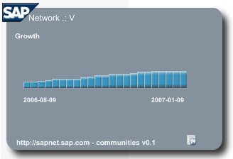 Again a work in progress and does not account for values exceeding 100 but it would be quite easy to show percentages or the delta (change from one week to the next) on the chart instead of the overall number. It's a funny thing about graphs they can be creating in many ways from Flash to CSS, and there are some excellent components and pieces out there to use but if you are looking for a simple and quick view of something this is usually the easiest way with the least amount of overhead. Once this is complete I hope to be able to launch it and it cycle automatically through every area showing me the results in a slide show manner, this of course giving me the direct ability to see drops or rises in an area and focus my energy quicker and easier. 2007 is definitely the year of the Widget...
