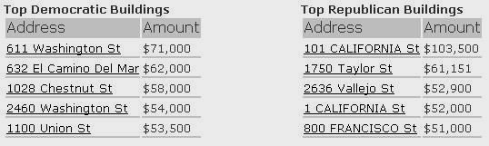
One of the powers of using geospatial software is that large volumes of data which do not make much sense in tabular form can deliver unique insights when plotted on a map. Which large volumes of SAP data could be plotted on a map? What are your ideas? Very timely for Election Day here is an example which I saw now already a year and a half ago at Where 2.0 in San Francisco, and it is from the last presidential election... but still as valid as ever. This series of maps and other screenshots shows a visualization of campaign contribution data from the U.S. For non-U.S. citizens it may seem that campaign contributions are a very private matter, but here it is indeed public data! Firstly there is an U.S. overview map. You see campaign contributions (looks like by three-digit ZIP code). The larger metropolitan areas have been broken down by party in a pie chart. Zoom to San Francisco, a largely democratic city. Why are there these big red spots on the top right? The largest circle is the headquarter of Goldmann-Sachs, an investment firm. Employees there (or the company) used the company address to make their contribution. You also see the horizontal strip of republican contributions near the water, which are more affluent areas. The last two screens show data "around me" at an address in S.F.: who do my neighbors give money too? And then there was the joke to make this app available on a GPS-enabled handheld device... and if you are in S.F. you could check what kind of neighborhood you are in, and say if you are a republican in a strong democratic neighborhood, seek the fastest path out of there to "friendly" territory. The source for this is at http://www.fundrace.org/