
- SAP Community
- Products and Technology
- Technology
- Technology Blogs by SAP
- SAP Tech Bytes: Understand your classification mod...
Technology Blogs by SAP
Learn how to extend and personalize SAP applications. Follow the SAP technology blog for insights into SAP BTP, ABAP, SAP Analytics Cloud, SAP HANA, and more.
Turn on suggestions
Auto-suggest helps you quickly narrow down your search results by suggesting possible matches as you type.
Showing results for
Developer Advocate
Options
- Subscribe to RSS Feed
- Mark as New
- Mark as Read
- Bookmark
- Subscribe
- Printer Friendly Page
- Report Inappropriate Content
07-16-2021
9:19 PM
In the previous post "SAP Tech Bytes: Your first Predictive Scenario in SAP Analytics Cloud" of the series, with just a few clicks we have built our predictive model using Smart Predict in SAP Analytics Cloud. Or maybe you have built a classification model by yourself based on some other data.
Before we move on and try to improve our first model, let's spend a few minutes to understand how and how well predictions are made by ML models. While Machine Learning can accelerate decision-making by automating it, it is important to trust predictions coming from trained models.
We've seen some of the indicators, namely Predictive Power and Predictive Confidence, in the previous post already.
As a reminder:
To better understand these indicators we first need to understand the % Detected Target chart.
And to understand this chart we first need to understand...
Let's re-apply the model to the same
Call the output
Open the
The Prediction Probability is the probability that the Predicted Category is the target value, in our case the target value is
The probability is calculated based on the contribution of influencers and their category influence of the trained model.
During the training phase, the model finds a threshold value that separates probability values matched into the target value. In our example, it found a value somewhere between roughly
We can see as well the distribution of the probability values for our example.
Now, having the understanding of the prediction probability, we should easily understand...
The Detected Target chart was nicely explained by stuart.clarke2 in unit 1 "Model Performance Metrics" of week 5 of the openSAP course Getting Started with Data Science.
To get this chart we order all observations (aka "the population") from the dataset by their predictive probability results from the highest to the lowest along the X-axis. The Y-axis will represent the percentage of targets (in our case where
The Validation partition of the
We do not know how exactly observations had been split between these two partitions, but we know that the Validation partition contained 36.59% of observations with the
Therefore the perfect model would require 37% of observations ordered by the predicted probability to detect all 100% of those who survived. On the other hand, the random selection of 37% without any model should statistically give us 37% of targets detected.
Therefore the closer the results of a model applied to the validation partition of the dataset to the perfect model results the better!
While we do not know the random split between partitions used during the training process, we can still apply the model to the
So,
Once the model is applied open the
Scroll down and you find the first mismatch between the Survived and Predicted Category columns. In this case, we got the False Positive: an observation that the model classified as a target (a person should have survived), while in reality, it was not. This is where on the chart we would see the difference starts between the Perfect Model and Validation lines.
Scrolling up from the bottom of the dataset we will find as well the last case of the False Negative: an observation that the model wrongly classified a person who survived.
Let's check how many false predictions are there. Open the Custom Expression Editor and add a new
Execute it and check the distribution of matches.
...we can see that it required 87% of observations from the Validation partition to capture all 100% of the required target, i.e. where
I hope this exercise helped reading this chart and this should help us to understand better...
Again, these Performance Indicators were nicely explained by stuart.clarke2 in unit 1 "Model Performance Metrics" of week 5 of the openSAP course Getting Started with Data Science.
In our example go to the chart's settings and add Training to the Y-Axis.
Visually, in very simple terms:
Equipped with this knowledge we will try to improve our classification predictions in the next post of the series.
Stay tuned!
-Vitaliy, aka @Sygyzmundovych
Before we move on and try to improve our first model, let's spend a few minutes to understand how and how well predictions are made by ML models. While Machine Learning can accelerate decision-making by automating it, it is important to trust predictions coming from trained models.
Global Performance Indicators
We've seen some of the indicators, namely Predictive Power and Predictive Confidence, in the previous post already.

As a reminder:
- Predictive Power is the main measure of predictive model accuracy. The closer its value is to 100%, the more confident you can be when you apply the predictive model to obtain predictions.
- Prediction Confidence is your predictive model’s ability to achieve the same degree of accuracy when you apply it to a new dataset that has the same characteristics as the training dataset. This value should be as close as possible to 100%.
To better understand these indicators we first need to understand the % Detected Target chart.

And to understand this chart we first need to understand...
Prediction Probability
Let's re-apply the model to the same
test dataset as before, but this time including Prediction Probability in addition to the Prediction Category in the output.Call the output
test-predictions-probability.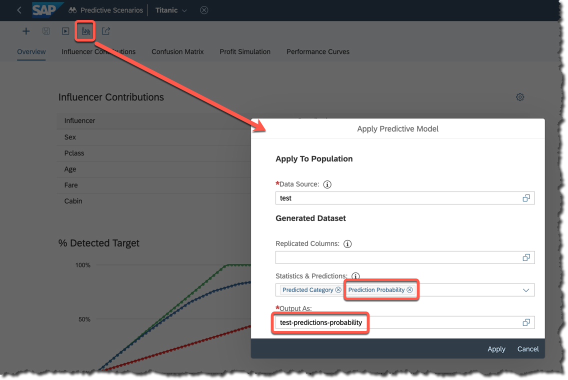
Open the
test-predictions-probability and order the data by the probability column.
The Prediction Probability is the probability that the Predicted Category is the target value, in our case the target value is
1 meaning a passenger had survived.The probability is calculated based on the contribution of influencers and their category influence of the trained model.
During the training phase, the model finds a threshold value that separates probability values matched into the target value. In our example, it found a value somewhere between roughly
0.419 and 0.425 that defines if a record being classified as 0 or 1.We can see as well the distribution of the probability values for our example.
Now, having the understanding of the prediction probability, we should easily understand...
Detected Target Curve
The Detected Target chart was nicely explained by stuart.clarke2 in unit 1 "Model Performance Metrics" of week 5 of the openSAP course Getting Started with Data Science.

To get this chart we order all observations (aka "the population") from the dataset by their predictive probability results from the highest to the lowest along the X-axis. The Y-axis will represent the percentage of targets (in our case where
Survived is equal 1) identified in the population compared to the total number of targets.The Validation partition of the
train dataset is used to evaluate the quality of the model. It could compare the Predicted Category (produced by the model trained on the Training partition of the dataset) with the ground truth, i.e. with the real value of the Survived variable for each observation.We do not know how exactly observations had been split between these two partitions, but we know that the Validation partition contained 36.59% of observations with the
Survived variable equal to 1.
Therefore the perfect model would require 37% of observations ordered by the predicted probability to detect all 100% of those who survived. On the other hand, the random selection of 37% without any model should statistically give us 37% of targets detected.
Therefore the closer the results of a model applied to the validation partition of the dataset to the perfect model results the better!
Let's do a small exercise
While we do not know the random split between partitions used during the training process, we can still apply the model to the
train dataset to get the idea.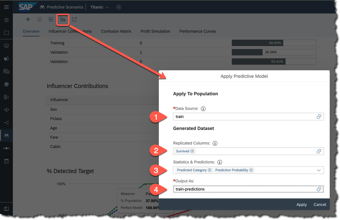
So,
- Apply the same
traindataset used to train the model, - Include
Survivedinto replicated columns, - Include both
CategoryandProbabilityinto the output, - Save the result as
train-predictions.
Once the model is applied open the
train-predictions dataset and sort decreasingly by the Prediction Probability column.Scroll down and you find the first mismatch between the Survived and Predicted Category columns. In this case, we got the False Positive: an observation that the model classified as a target (a person should have survived), while in reality, it was not. This is where on the chart we would see the difference starts between the Perfect Model and Validation lines.

Scrolling up from the bottom of the dataset we will find as well the last case of the False Negative: an observation that the model wrongly classified a person who survived.

Let's check how many false predictions are there. Open the Custom Expression Editor and add a new
Match column defined as below.[Match] = if(
[Survived] == 1,
if ([Predicted Category]==1, "True Positive", "False Negative"),
if ([Predicted Category]==0, "True Negative", "False Positive")
)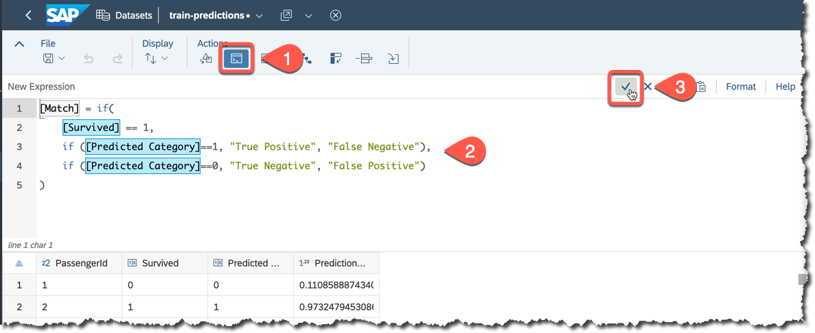
Execute it and check the distribution of matches.

Now, going back to the Detected Target chart...
...we can see that it required 87% of observations from the Validation partition to capture all 100% of the required target, i.e. where
Survived was equal to 1.
I hope this exercise helped reading this chart and this should help us to understand better...
Predictive Power and Predictive Confidence
Again, these Performance Indicators were nicely explained by stuart.clarke2 in unit 1 "Model Performance Metrics" of week 5 of the openSAP course Getting Started with Data Science.

In our example go to the chart's settings and add Training to the Y-Axis.

Visually, in very simple terms:
- Predictive Power shows how close the Validation curve is to the Perfect Model, so the results of predictions are correct, and
- Predictive Confidence shows how close the Validation curve is to the Training curve, so we should expect similar Predictive Power when applying the model to the dataset with similar characteristics as the dataset used to train.
That's it for now, but if you are interested...
...in a more in-depth review of indicators, then please check Classification in SAP Analytics Cloud in Detail by thierry.brunet.
Equipped with this knowledge we will try to improve our classification predictions in the next post of the series.
Stay tuned!
-Vitaliy, aka @Sygyzmundovych
- SAP Managed Tags:
- Machine Learning,
- SAP Analytics Cloud,
- SAP Analytics Cloud, augmented analytics
Labels:
You must be a registered user to add a comment. If you've already registered, sign in. Otherwise, register and sign in.
Labels in this area
-
ABAP CDS Views - CDC (Change Data Capture)
2 -
AI
1 -
Analyze Workload Data
1 -
BTP
1 -
Business and IT Integration
2 -
Business application stu
1 -
Business Technology Platform
1 -
Business Trends
1,661 -
Business Trends
91 -
CAP
1 -
cf
1 -
Cloud Foundry
1 -
Confluent
1 -
Customer COE Basics and Fundamentals
1 -
Customer COE Latest and Greatest
3 -
Customer Data Browser app
1 -
Data Analysis Tool
1 -
data migration
1 -
data transfer
1 -
Datasphere
2 -
Event Information
1,400 -
Event Information
66 -
Expert
1 -
Expert Insights
178 -
Expert Insights
293 -
General
1 -
Google cloud
1 -
Google Next'24
1 -
Kafka
1 -
Life at SAP
784 -
Life at SAP
12 -
Migrate your Data App
1 -
MTA
1 -
Network Performance Analysis
1 -
NodeJS
1 -
PDF
1 -
POC
1 -
Product Updates
4,577 -
Product Updates
340 -
Replication Flow
1 -
RisewithSAP
1 -
SAP BTP
1 -
SAP BTP Cloud Foundry
1 -
SAP Cloud ALM
1 -
SAP Cloud Application Programming Model
1 -
SAP Datasphere
2 -
SAP S4HANA Cloud
1 -
SAP S4HANA Migration Cockpit
1 -
Technology Updates
6,886 -
Technology Updates
416 -
Workload Fluctuations
1
Related Content
- Adversarial Machine Learning: is your AI-based component robust? in Technology Blogs by SAP
- Adversarial Machine Learning: is your AI-based component robust? in Technology Blogs by SAP
- Demystifying Transformers and Embeddings: Some GenAI Concepts in Technology Blogs by SAP
- Boosting Benchmarking for Reliable Business AI in Technology Blogs by SAP
- Digital Twins of an Organization: why worth it and why now in Technology Blogs by SAP
Top kudoed authors
| User | Count |
|---|---|
| 30 | |
| 23 | |
| 10 | |
| 7 | |
| 6 | |
| 6 | |
| 5 | |
| 5 | |
| 5 | |
| 4 |